That last one seems pretty far off. I’m grateful to Avery Yeates, who was one of my Summer Research Students this year. We tweaked the Maple program I had been using a bit. We separated out the congressional districts in Maine and Nebraska and we ramped up the variance in the individual state elections. The old variance made sense for a weighted coin toss, where the probability is static. It didn’t reflect the variance we see in election results. We’re estimating the probabilities that a voter will vote for a candidate. These change over time, in fact, the entire point of campaigning is to shift those probabilities. I need to look at correlating the states that move together for 2024.
With that said, here’s my final prediction.
My gut tells me that there will have been a big shift in Biden’s direction over the weekend. It’s looking more and more like he is going to win and people like voting for a winner.
In addition, the news has not been good for President Trump. We’re hitting records for the number of new cases of Coronavirus each day and some of the behavior we’re seeing from a small segment of Trump supporters is downright disturbing. If there are any swing voter’s left, I think that pushes them in Biden’s direction. Of course, I could be completely wrong. I’m least confident that Texas will turn blue. They had a huge number of early voters and so, fewer people to be swayed over the weekend. On the other hand, some of the outrageous behavior seems to be motivated by the belief that Trump could lose.
If you’re curious about my track record, this contains my prediction for 2018.
“If you haven’t read it, it’s new to you” to paraphrase an old NBC slogan that really seemed to piss people off at the time.
I hope you’re enjoying Election Day, especially geeking out on the politics if that’s your thing.
While I finish up my last projection and final prediction, here are some old election related blog posts you might like. They’re pretty good if I do say so myself. I really wanted to update “Vote Anyway” for 2020 but sadly, time got away from me.
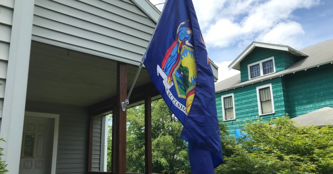
Happy Election Day 2020! I hope every one who hasn’t is planning to vote. More on that later. Here are two flag related things about this year’s elections.
We’ve decided to fly a 48-star American Flag to mark the day of one of our most important patriotic duties. Why the 48-star flag? Well, the 48-star flag had the second-longest tenure as the nation’s official flag, from 1912 to 1959, and not once in that time did we suffer an electoral inversion where the Electoral College failed to elect the winner of the popular vote.
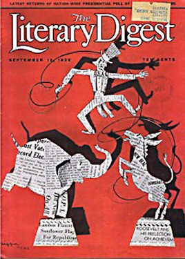
The 48-star flag was also the flag for the 1936 Election which is notable for two reasons. It’s the election where Literary Digest predicted a landslide victory for Republican Alf Landon. Don’t recall President Landon? There’s a good reason for that. The Literary Digest poll is literally a textbook example of how not to predict the winner of an election. Predicting that Landon would win 57% to 43%, they were off by a whopping 19 points! That’s the largest error ever in an important opinion poll. Don’t worry though, we’re a lot better at it now.
The other reason the 1936 election is noteworthy is that it holds the record for the largest electoral-vote landslide in American History. President Roosevelt won 527 electoral votes to Landon’s 8. That, to borrow a joke from Barbara Holland, was the start of that old saying, “As Maine goes, so goes Vermont.”
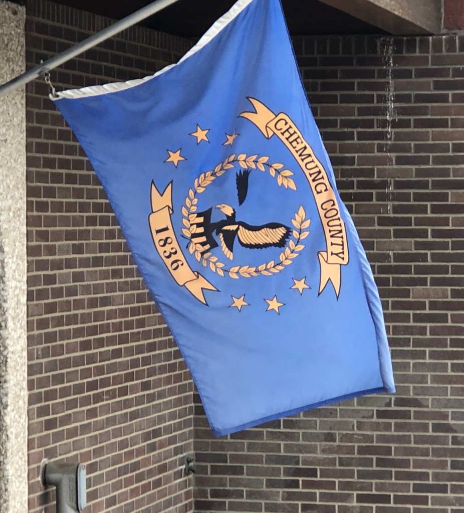
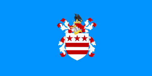
There’s another flag with a connection to Election Day this year because Joanne and I actually cast our ballots on the 24th of October, the first day of early voting. It took us just over an hour of standing in line and chatting with some friendly people to get to the voting booths. Toward the front of the line, in front of the Board of elections, I finally got a good look at a Chemung County flag. It’s the only one I’ve ever seen in the wild and it’s pretty good. It’s got an eagle and a wreath and some stars and it only uses three colors. It ticks off some of the NAVA standards. It could do without all the text and I have no clue about the symbolism but as a municipal flag, it’s above average.
I’ve been trying to find time to write about the election, but that seems more impossible by the day. On the other hand, I already have friends and family who are voting in Florida and the top-two primary system is on the ballot there. This one is time-sensitive.
Top-two simply isn’t a good idea. Our country desperately needs voting reform, but top-two isn’t voting reform, it’s doubling down on all the inherent problems of the plurality vote and making them a bit worse. Do you want real voting reform? Look for a group promoting instant run-off voting like they do in Maine, even better IMO, approval voting. The links take you to organizations doing just that.
But first, do no harm. Here’s an opinion piece I wrote ten(!) years ago about the so-called “Jungle Primary.” It ran in the Star-Gazette, our local Elmira paper and the Binghamton paper and possibly one or two others across the state.
If I don’t force the issue from time to time there will be nothing new on this blog for months at a time. Most of my energy at the moment goes into preparing to teach, teaching, recuperating from teaching, grading, and tech support as we adapt again to our new online environment. Now I’m relearning stuff I had figured out back in May.
But I’d set the precedent of live blogging the debates and this one seems important enough that it’s worth a later night than usual. I probably won’t have the chance to make this one look pretty for a few days. So far I know that the debate was going to be at Notre Dame but it isn’t because COVID. Now it’s in Cleveland. Moderated by Chris Wallace of Fox News Sunday.
Leading into the debate, it seems to me that things aren’t going too well for President Trump. The NYT released his taxes over the weekend and it does not look good. That followed revelations about the President making some unfortunate comments about the military and the comments about possibly refusing to respect the results of the election are not a good look.
At this moment, the election looks like it’s Vice President Biden’s to lose. But I think he’s lost a step or two in the last few years. I think he needs to perform the way he did in the debate against Paul Ryan in 2012, but I wonder if he still has that in him. In any event, it’s a mistake to underestimate Donald Trump. He did nothing but exceed expectations in the 2016 election.
8:45
Hillary Clinton is on MSNBC giving advice. I’m having second thoughts already.
9:06
We start with SCOTUS, the elephant in the room. This is more reserved than I’m used to. Trump’s arguments here are already disingenuous.
9:08
Biden is sedate this evening, but the argument he’s making about the SCOTUS nomination is the right one.
9:11
This is an interesting exchange.
9:15
Trump is fighting with the moderator which is an interesting strategy. He rails against the individual mandate which is the thing that makes the ACA work.
9:18
Biden calls out Trump’s lies. Good line about getting lucky.
9:20
Trump is repeating things he said in 2016 that never played out. Biden: “Will you shut up man” and “This is so unpresidential.”
9:25
Trump is claiming that he saved thousands of lives and is blaming the “Fake News.”
H1N1 was a disaster??
9:33
Trump is claiming that Biden isn’t smart.
9:38
Trump seems to be especially transparent tonight. I think Biden’s hitting the right tone by just laughing at the President.
9:42
“I brought back football.” Hilarious.
9:44
Trump claims he paid millions in taxes in 2016.
Biden: “You’re the worst president this country has ever had.” My money’s still on Bush, but that made me laugh really hard.
9:50
I think the only way we could have a real debate between these two is to put them in separate rooms.
9:55
Decency. Yes. More of that, please.
9:57
Right at the racism. Nice. And the puzzled look on Biden’s face is priceless.
10:04
I need to train for these. One hour in and I’m fried.
10:11
“There has never been a president who has done more than I’ve done.” Is it because of the number of Judges? That ignores the obstruction under McConnell.
10:26
“Stand back and stand by” is easily the most chilling moment of this debate.
10:29
Biden’s been good on election security. But “We’ve caught them all?” Trump is incoherent on election security.
10:36
Trump refuses to ask his supporters to stay calm during an extended count. That’s troubling. Biden is strong here again.
Analysis:
I don’t think this will change anyone’s mind. It was a mess. Just watching it was exhausting. At best I think Trump was playing to his base which isn’t going to be enough.
I was going to say that this was a draw, but now I think the more we unpack what Trump said here the better Biden is going to look.
On 8 September 1966, after two years in development, Star Trek finally debuted on the teevee. Fans have celebrated this date as “Star Trek Day” unofficially for a while now, but the producers of the show have now gotten on board and today, 2020.09.08 is the first Official Star Trek Day with events like marathons, cast reunions and more. “Encounter at Farpoint” is airing on StarTrek.com as I write this.
In our little corner of the Alpha Quadrant, we’re marking the occasion by flying the flag of the United Federation of Planets. We’ve flown the UFP flag before and you can read my original post about the flag here.
That post contains my thoughts on the flag. For today I thought we’d look at two precursors of the UFP flag and a proposed redesign. The UFP apparently had no flag in the Original Series. The Star Fleet Technical Manual (Joseph, 1975) had a Banner, which can be seen in “And The Children Shall Lead” and it had a seal shown here, possibly designed for the book cover. This seal would make a passable flag itself.
The first place we see an image similar to the “current” UFP flag is on a view screen in Star Trek the Motion Picture when Kirk addresses the crew. This same image is seen as a flag, draped across the Torpedo Tube at Spock’s funeral in The Wrath of Khan.
This clearly looks like a hybrid of the Tech Manual’s seal and the current flag design. There are two advantages over the current design for me. There’s no text and the wreath looks less like something of terrestrial origin.
The last image we’ll look at today is a proposed redesign of the UFP flag that I found on Reddit, created by Doliam13.
This fixes a lot of the issues with the current UFP flag. The text is gone and the star field is more symbolic, looking less like a literal map of our local piece of the Milky Way. This also fixes some of the symbolism in the current design. There are four stars to represent the four founding civilizations of the Federation where the current flag highlights only three. The notion that the three stars represent three of the founding worlds as seen by an observer standing on the fourth is an inane retcon contrivance. Better to just fix the flag and not try to explain it.
A few last things to mark the day. Science Officer Leonard (named for McCoy, Leonard H. Son of David) is properly attired and ready to face the day while I have two different pairs of let’s call them “Spocky socks” that I’ll wear throughout the occasion. The blue, black, and gold pair were made by my lovely wife, Joanne while the pair with the Vulcan salute was a gift from my sisters-in-law.
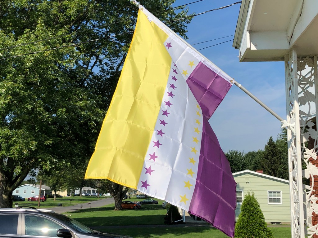
It’s now the 100th Anniversary of the day that Tennessee became the 36th state to ratify the 19th Amendment, and the United States officially recognized women’s right to vote. We’re once again flying a “19th Amendment Victory Flag” to mark the occasion. I wrote about this flag last year. It’s based on the flag of the National Women’s Party, a gold, white, and purple tri-color with 36 stars added for the thirty-six states that approved the amendment. The story about how the amendment passed is great. It’s also amazing that something that seems so unequivocally the “right thing to do” by modern sensibilities came down to a single vote. You can find that story in last year’s article: 19th Amendment Victory Flag.
A turning point in that story involved a political cartoon where Carrie Chapman Catt, the President of the National American Woman Suffrage Association, was sweeping the letters “RAT” toward the letters “IFICATION,” symbolizing the campaign to support the amendment. When I was thinking about what to write this year, I spent some time looking for that political cartoon. If you’ve read this blog, you know I like to write about comics, history, and flags. History and flags are part of the “The Universe and Everything” part. Anyway, at some point I put “Carrie Chapman Catt” and “Cartoon” into duckduckgo.com and stumbled upon something in the nice triple intersection of the Venn diagram implied above. Ha! Math! There’s another thing!
I’ve always considered DC Comics to be the more conservative of the two major comic book companies. They were static for a long time while Marvel was innovating and they were so dedicated to their own house style that they had other artists redraw Jack Kirby’s pictures of Superman when he was working on Superman’s Pal, Jimmy Olsen. I get that those are small-c conservative, but you have to admit that’s pretty conservative. It’s like putting pants on Michelangelo’s David.
So, what was in that intersection mentioned above? “Wonder Women of History,” a backup feature that ran in Sensation Comics and Wonder Woman for twelve years starting with Wonder Woman #1 in 1942. Each issue featured a short biography of 1 to 5 pages, full of cheesiness and hyperbole. These included the stories of figures like Abigail Adams, Joan of Arc, and Marie Curie. Among the women featured were two important leaders of the suffrage movement taking us from the Seneca Falls Convention to the passage of the 19th Amendment.
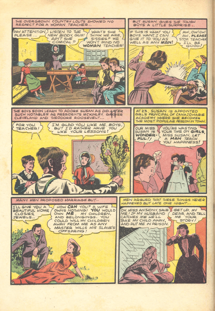
And in honor of the Centennial of that Amendment, here is the biography of Susan B. Anthony from Wonder Woman #5 (June-July 1943).
We also present the reason for the search result; Comic Vine tells me that Carrie Chapman Catt is a comic book character in Wonder Woman #26 (November-December 1947). That has the incongruous title of “Speed Maniacs from Mercury.” Luckily, that’s not the story in which Mrs. Catt appears.
Eventually, Wonder Woman of History was replaced with makeup tips and advice on landing a husband because DC is so progressive. But the Wonder Women of History were fun while it lasted. If you like these, there are a lot more here. It was nice when comics tried to educate as well as entertain.
Happy Belated Fantastic Four Day! Fifty-nine years ago this week Fantastic Four #1 hit the stands and to quote Aunt Petunia’s favorite nephew, “Nuthin’ was ever gonna be quite the same again.” The Fantastic Four is one of those things that I’ve liked as long as I remember. As a kid, I knew them first from their 1967 animated series. I don’t remember it that well; (it’s not like we form a lot of detailed memories when we’re three), but I liked it. Here are three personal firsts that are related to the Fantastic Four to mark the anniversary.
My First Fantastic Four Comic
The first Fantastic Four comic I remember buying was Fantastic Four #126 (September 1972). This was about a year before I decided I was “officially” collecting comics; I was getting comics pretty sporadically at the time. But what an amazing place to start! Inside, the title is “The Way It Began!” and the cover is a stunning recreation of Kirby’s cover to FF#1 drawn by the inimitable team of John Buscema and Joe Sinnott. This comic defined my mental picture of the FF for all time.
The story is good as well. Initially, Roy Thomas treats us to the standard flavor of family brouhaha with which Lee and Kirby brilliantly began so many issues. Reed tinkers and then does the absent-minded-professor thing. Ben and Johnny bicker. Sue tries to keep things on track. Also Alicia. Classic. This leads us into a framing sequence where Ben is reminiscing using Reed’s thought-projector helmet which does exactly what one would expect a thought-projector helmet to do.
The thought-projector helmet… erm… projecting thoughts.
Ben then narrates a shortened version of the origin from FF #1, which ends with the iconic image below. I expect that many copies of this issue are missing this page; it’s one of the quintessential team pin-ups.
Short summaries of the team’s first encounter with the Mole Man and the Mole Man story from issues 88-90 follow. In that last story, the Mole Man uses a device that blinds the team and Ben has an epiphany. If the Mole Man’s device can blind and cure the team, maybe he can use it to cure Alicia’s blindness. He storms off intending to help her.
After a year or two, FF #126 was made into one of those Power Records sets with the recorded dialogue. If Johnny’s voice sounds familiar, that’s Peter Fernandez, aka Speed Racer! (The “!” may be obligatory). Thanks to the magic of YouTube, you can experience the entire issue with the dialogue abbreviated somewhat here.
My First Blog Post.
Two years ago Marvel published a facsimile edition of Fantastic Four #1, part of the promotion for the latest series of Fantastic Four that started shortly thereafter. That seemed like a big deal at the time. “The World’s Greatest Comix Magazine” had been off the market since April 2015 because some executive at Marvel was having a pissing match with 21st Century Fox and didn’t want to do anything to promote Fox’s latest FF movie including publishing their own flagship title.
Anyway, I’d wanted to review the Facsimile edition. I’d previously done some short reviews that I posted on Facebook, like this one and this one here, but a Facebook post was utterly unsuitable for what I wanted to do for the Facsimile edition. I wrote All In Color for Forty Dimes and a week or so later I had a blog. This blog.
My First Fan Letter
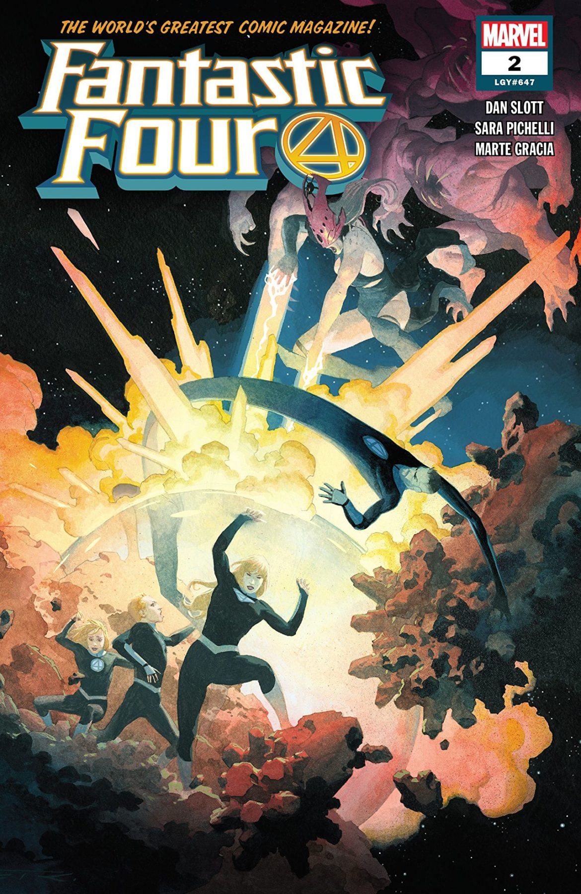
The letter itself is pretty self-explanatory. It wasn’t printed because as I now realize it’s much too long. For your edification, an open letter to Dan Slott, referencing Fantastic Four (2018) #2. What do you need to know about the book to appreciate the letter? Not too much. This is the first time we’ve seen Reed, Sue, and the kids since Secret Wars. They, along with Molecule Man and the Future Foundation have been rebuilding the multiverse one universe at a time. Franklin rebuilds the universes and then the group explores them; they’ve been at it for five years or so and time seems to have passed more quickly for them than it has on Earth. Franklin and Valeria are teenagers.
At some point, Franklin loses the ability to create universes. Evidently, all is now right with the multiverse; Franklin is done.
And the “Multiverse” has to fight back as the personification of one of the fundamental forces of nature.
Confrontation commences. It’s not pretty. Then this.
You can read the rest for yourself; here’s my letter.
Dear Dan,
Fantastic Four has been my favorite comic for almost forty years. I’m thrilled to have Fantastic Four back on the spinner racks; the Marvel Universe doesn’t work correctly without its first family. When I heard that you’d be helming the book, I was pleased. You always seemed to have a good understanding of the characters; from their guest appearances in Amazing Spider-Man, to your 8-issues on The Thing and everything in between.
Issue 1 was an unadulterated pleasure. I also really enjoyed issue 2, but there was one false note I’d like to address.
Reed is a tricky character to write; this was never more evident than in Civil War. Tony is an engineer who thinks pragmatically. His position in Civil War made sense. Reed by contrast thinks like an academic working forward from first principles. He has strong sense of right and wrong. He should have been the first person to come over to Cap’s side, rather than the last. Reed’s characterization in that series is wildly off the mark, it’s almost closer to Victor than it is to Reed. Civil War 2, incidentally, showed us how necessary the Four are to the Marvel Universe. In that series, Reed was the person we needed to refute Carol’s arguments, but Reed was unavailable.
So what didn’t ring true in FF #647/2? That Reed would bypass 208 realities teeming with life to secure a better chance of saving the rest. Reed decides things based on principles, not pragmatics. When Galactus lay dying, it was Reed who insisted on saving him despite the risk; Tony, the pragmatist, was overruled. Reed is confident; he strode into the afterlife without hesitation to save Ben. We see this confidence after the Future Foundation was routed by the Griever. It should have been evident before then. Reed doesn’t make tactical retreats nor does he take the easy way out. In the Galactus Trilogy, a tactical decision might have been to try to quickly develop a way to preserve some life, while Galactus consumed the Earth’s energy. Instead Reed confronted Galactus with the Ultimate Nullifier. A riskier decision, but one that preserved virtually all life on Earth.
I hope this is helpful. Aside from this, these first two issues were like a trip home. You have to be careful writing Reed. When you start pulling parts out of what makes him Mr. Fantastic, you could end up with the Maker and that would be a travesty.
Joseph F. Kolacinski Horseheads, NY
Reed’s characterization has been hit-or-miss for a while; at least since Civil War. One of those posts that’s been waiting in the wings is called “Writing Reed Right,” but that’s a big undertaking. I don’t even have a guess as to when that might be finished.
Where’s a thought-projection helmet when you need one? I hope you enjoyed my reminiscences. We’re now on a twelve-month countdown to the 60th anniversary. We’ll need something pretty big for that. Any suggestions? Do you remember your first Fantastic Four comic? Let us know in the comments!
I’ve been looking forward to Star Trek: Lower Decks for a while now. Maybe more than a while. They’ve been talking about a Star Trek series featuring the support crew for a long time. I think that initially morphed into the Next Generation episode that was also called “Lower Decks.” That was a fine, but not a spectacular episode of TNG. The notion surfaced again, sort of, with Star Trek Discovery, the only Trek series where the captain was not the central character. Lots of people seem to like Discovery, but I don’t really care for it.
It was the showrunner who got my attention. Mike McMahan had a Twitter feed, and that Twitter feed spawned a book. It’s called Warped, and it’s about a mythical eighth season of Star Trek: The Next Generation. This season, kept secret, was purposely so bad that it would force Paramount to cancel the series. Warped is pretty good, but not so good that I actually finished it. There are still some good bits like Westley splicing tribble DNA into Data’s cat, Spot, and the final fate of the Vulcan Punk band “Logic Lice!”
McMahan was also a writer on Rick and Morty
which isn’t everyone’s cup of tea but it is consistently well written and interesting. It’s also deeper than most people probably think it is. If you want to see a classic trek concept (“The Enemy Within”) spun in an interesting way check out “Rest and Ricklaxation.” McMahan didn’t share a writing credit on that but he was head writer for a while and he did write “Total Rickall“, “The Rickshank Rickdemption,” and “Edge of Tomorty: Rick Die Rickpeat,” all of which are both excellent and hilarious.
That’s a long preamble if I’m here to talk about Lower Decks. How was the first episode? I really enjoyed it. More importantly, I laughed. A lot. It’s recognizably Trek. It turns out that what that idea to make a show about, as McMahon puts it, “the people who put the yellow cartridge in the food replicator so a banana can come out the other end,” work is animation, comedy, and some good writing. The pilot, “Second Contact” is a lot of fun. Mariner and Boimler immediately fall into some familiar patterns and Tendi reminds me of Bashir when he first arrived at Deep Space Nine; full of awe and enthusiasm.
I liked how a much bigger story involving the senior staff developed behind the more mundane adventures of the ensigns and how these all dovetailed into a satisfying denouement. There are enough references to classic trek to give an old fan like me a warm feeling about the show. That includes the theme music by the way. It’s evocative of Alexander Courage’s original theme but just when you think you know where it’s headed it veers off in a different direction. Paradoxically the theme seems simultaneously very much the same and very different from the original series theme.
“Second Contact” isn’t perfect. Like most pilots, it’s an origin story and like most origin stories the plot takes a bit of a back seat to character introductions. At this stage, most of the characters feel like archetypes, but the broad outlines are solid and I’m looking forward to watching the show fill in those outlines. It’s refreshing to see a lighter take on Star Trek again. Modern trek has taken itself very seriously up til now, but comedy is also part of the franchise’s DNA. I’m looking forward to seeing the spiritual descendants of “Q Who” or “A Piece of the Action” and Lower Decks may be the show to give us those.
Okay, so maybe slightly later than “later this week.” None the less, here is the conclusion to the first installment of our series on state flags. If you haven’t read the first part of this, it’s here.
Without further ado, my choices for the best of the state flags, #6 to #1.
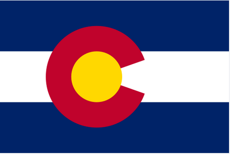
6. Colorado
It’s interesting how your quickly opinions can change on some of this subjective stuff. Although Colorado has an objectively nice flag, this morning it’s looking like a piece of sporting apparel and I’m now pondering if it belongs in the category of flags that need a minor tweak. Not going to do it; that way lies madness. Well, maybe in the comments if there’s interest.
This flag technically breaks two of NAVA’s five criteria, there are four colors and the large “C” is text. But this is another flag that Good Flag, Bad Flag uses to demonstrate that one can depart from their principles “with caution and purpose,” calling the “C” a “stunning graphic element.”
The Colorado National Monument
Each of the four colors carries symbolic meaning. The red, perhaps most significantly, represents the land. “Colorado,” the name of first the river and then the state literally means “colored red.” The gold evokes the abundant sunlight, the blue the sky, and the white, the snow-capped mountains.
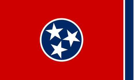
5. Tennessee
The “Tri-Star Flag” is a nice flag with some nice symbolism, but boy is that a lot of red! That’s not really to my taste. Still, the centerpiece makes a nice symbol that is used by businesses and sports teams. The three stars represent the three “Grand Divisions” of Tennessee defined in the state constitution, East Tennessee, Middle Tennessee, and West Tennessee. These divisions are “bound together in indissoluble unity” within the blue circle by the “unending white band.” The blue band is merely a design element to relieve, as LeRoy Reeves, the designer puts it, “the sameness of the crimson field and prevents the flag from showing too much crimson when hanging limp. The blue band is symbolically a bit of a missed opportunity. In its current location, it could represent the Blue Ridge Mountains on the eastern border of the state. On the left, it could symbolize the Mississippi River, the western border. Do both and the flag becomes a metaphorical map of Tennessee. The star placements are established by state law and are a bit fiddly; a commemorative stamp issued in 1976 showed the stamp upside down.
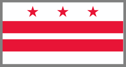
4. The District of Columbia
The nation’s capital was founded in 1791. It had to wait until 1938 before a flag was chosen, but at least it’s an objectively good flag. The design is striking and is based on the Washington family’s Coat of Arms so the symbolism more-or-less takes care of itself. The flag was designed by a three-member commission appointed by Congress and was initially a symbol of the District’s lack of representation. Ironically, Washingtonians have since embraced the flag. It appears on merchandise throughout the district and is used prominently by the DC Statehood Movement.
When a seal or a coat of arms is used in the design of a flag, the usual approach is to merely place the seal on a solid colored background as we see at left, and then perhaps add the name, a date of a motto to the flag. None of those are improvements. The DC flag is an object lesson in how to use a seal or a coat of arms as an inspiration for flag design. The trick, in this case, is to focus on one or two clear and distinctive design elements, rather than trying to include the entire coat of arms. Another excellent example can be found in this video.
3. Hawaii
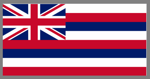
Having the British flag in the canton of one of the thirteen original colonies would be kind of obnoxious, but here makes for a beautiful and distinctive flag. Before the War of 1812, King Kamehameha I flew the Union Flag over his home. This flag had been a gift from Britain’s King George III. During the war, this was replaced by the American flag until some British officers objected. Kamehameha responded by commissioning a new flag that was a hybrid of the two. Britain is represented in the canton while the stripes and their colors symbolize the United States. The eight stripes each stand for one of Hawaii’s major islands, echoing the symbolism of the American flag. Hawaii’s flag is one of only two state flags to have been the flag of an independent country and it is the only flag to fly over a kingdom, a republic, an American territory, and a state.
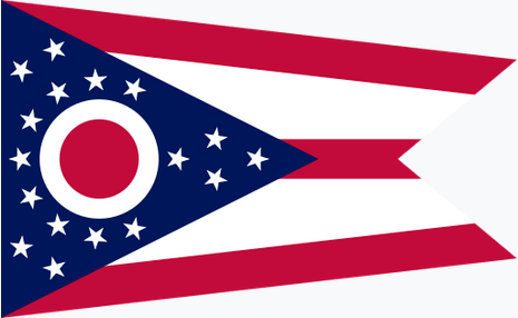
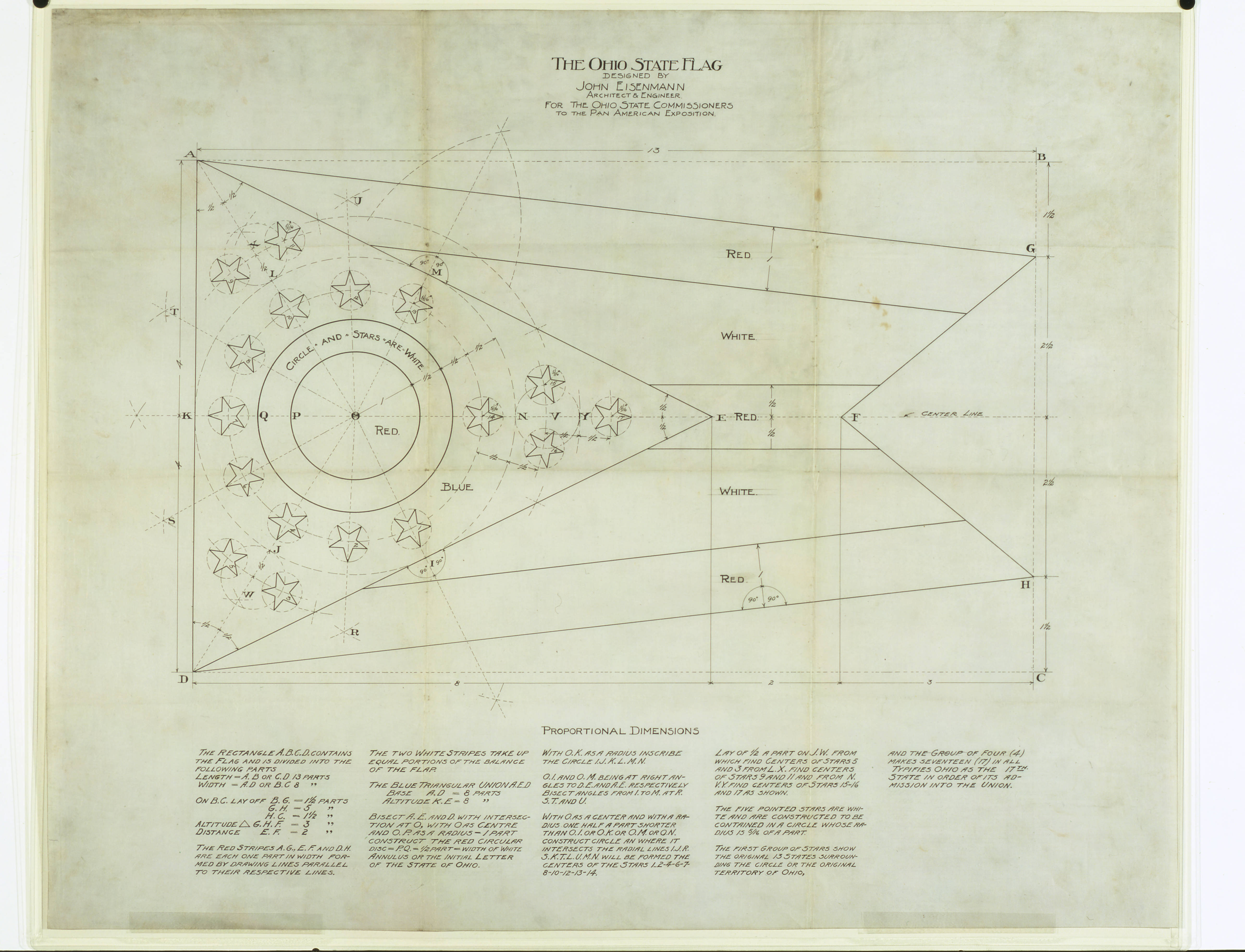
2. Ohio
NAVA’s fifth principle of flag design is to “Be original or be related.” Ohio’s flag is proof that the “or” is not exclusive. It’s certainly “related.” Of all the state flags, Ohio’s flag has the strongest resemblance to the Stars and Stripes. It is also original. It’s the only non-rectangular state flag and the blue triangle on the hoist as well as the white-and-red “O” are distinctive.
Virtually every element of the flag has meaning. The triangular swallowtail shape is thought to hearken back to flags carried by Ohio units in the Civil and Spanish American wars. The five stripes symbolize the roads and waterways of the state while the blue field stands for Ohio’s hills and valleys. The 13 stars encircling the “O” represent the thirteen original states while collectively the 17 stars evoke Ohio’s position as the 17th state to join the Union. The “O” doesn’t merely stand for the state’s name, it also suggests an eye and thus Ohio’s nickname as the “Buckeye State.”
It’s interesting that, although we now recognize Ohio’s is a well-designed flag, it wasn’t initially so well received. The “seal-on-a-bed-sheet” model was ubiquitous among state flags. It was seldom used and compared to the flags of Cuba and the Philippines. It was particularly disparaged for the red center of the O’s similarity to the Japanese flag’s sun.
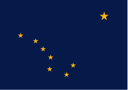
1. Alaska
Readers of this blog might recall that Alaska is my favorite state flag. It’s a simple, attractive flag. If you know anything about celestial navigation, at least some of the symbolism is easy to deduce. The location of the big dipper makes it clear that the larger star is the north star; symbolizing that Alaska is the northern-most state.
But there’s a lot more going on here, worthy of a post of its own. The flag was initially chosen as the territorial flag in 1927 after the Governor held a design contest open to school children in grades 7 through 12. The winner of the contest was 13-year-old Benny Benson, a native Alaskan. His entry was the unanimous choice of the panel of judges and was adopted unanimously by both houses of the territorial legislature. There’s synergy here; the blue represents not only the night sky but also the color of a forget-me-not which was later chosen as the state flower. Marie Drake, the assistant commissioner of education wrote a poem about Benson’s symbolism for an educational program about the flag. Elinor Dusenbury, a former Alaska resident, set the poem to music out of, as she put it, “pure unadulterated homesickness for Alaska!” The song was quite popular; it was chosen as the territorial song in 1955 and became the state song when Alaska became the 49th state. It is the only state song about a flag.
Benny Benson holding a homemade version of his flag
Eight stars of gold on a field of blue Alaska’s flag. May it mean to you The blue of the sea, the evening sky, The mountain lakes, and the flow’rs nearby; The gold of the early sourdough’s dreams, The precious gold of the hills and streams; The brilliant stars in the northern sky, The “Bear,” the “Dipper,” and, shining high, The great North Star with its steady light, O’er land and sea a beacon bright. Alaska’s flag to Alaskans dear, The simple flag of a last frontier.
Alaska’s Flag
Coming soon(?), the state flags that require minor alterations.