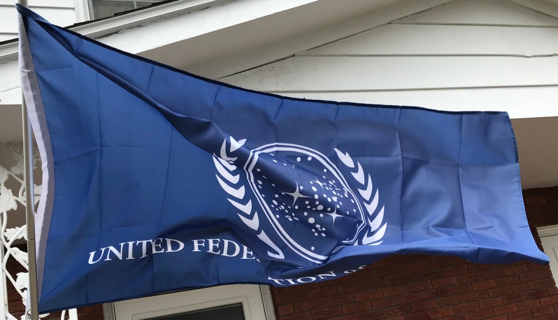
We’re flying a new flag this morning; specifically the flag of the United Federation of Planets. It flew for a day a few weeks ago, but it was wet and windy and the flag kept getting tangled around the pole so I decided to take it down for a bit.
In the meantime, we purchased a Valley Forge Tangle-Free Aluminum Pole (not pictured above) from the Horseheads Do It Center. It’s working beautifully so far. The flag is affixed directly to the pole through the grommets and the entire top section of the pole rotates freely. The weight of the flag itself keeps it from wrapping around the pole.
I like this flag, however, it puts me in mind of a lot of state flags, most of which are pretty dreadful. I, therefore, thought I’d look at it in terms of the North American Vexillological Association’s criteria for evaluating/creating flags.
NAVA’s five criteria for creating a good flag were first codified in 2001 when they conducted a survey to choose the best and worst flags on the continent. These are:
- The design of the flag should be simple enough that a child could draw it from memory.
- It should use clear and understandable symbolism.
- The flag should use common colors; probably no more than four different ones.
- Both text and seals should be avoided.
- Finally, the flag should be unique as it represents a distinct entity. It can however, show similarities to other flags, to show connections.
A nice example of the last criterion is the similarities between the flags of Ohio and the United States. The flags are distinct but the common elements make it clear that the US and Ohio are closely related.
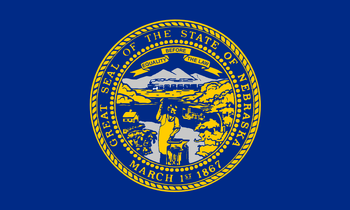
We could segue into a long discussion of state and province flags, but we’ll save that for another day. The existing state flag closest to the bottom of the NAVA survey was Nebraska.
The dubious distinction for last place was given to Georgia, but that flag was changed in 2003. Meanwhile, my favorite state flag has to be Alaska; simple and elegant with clear symbolism. It’s a classic.
The UFP flag fares pretty well according to the NAVA standards. The design is simple and clean. The colors, blue and white are classic and attractive. The weakest element of the flag is the text. Like the conventional wisdom assumes, it’s difficult to read as the flag waves in the wind, especially as the text is backward on one side of the flag. It’s also an odd choice; the Federation contained over 150 member worlds at one point, each of which probability had its own language. I think it remains an odd choice even though English had evolved into “Federation Standard.”
To think about the symbolism, it makes sense to look back to the obvious inspiration for the UFP flag, the Flag of the United Nations. The blue color was chosen in contrast to “red, the war color.” The world map represents all the people of the world. The map projection is surrounded by olive branches, a common metaphor for peace.
The similarities to the UFP flag are striking and the symbolism transfers in a straightforward manner. The branches are similar, though may not be of terrestrial origin. The galactic map with the density of the stars in an off-center diagonal line is evocative of a section of one of the spiral arms of the galaxy.
Earth and presumably most of the other member worlds of the Federation are located in the Orion Spur, a minor arm of the Milky Way, which exists between the Perseus and Sagittarius Arms of the galaxy. In-universe and otherwise, the similarities between the UFP flag and the UN flag make sense since one organization is clearly an inspiration for the other. If the UN still existed in the 23rd Century, the two flags might be too similar to be flown together, but I suspect the UN flag has been supplanted by a “United Earth” flag.
One place where the symbolism of the UFP flag seems lacking is that there are three stars in the galactic map that are stylized as four-pointed stars rather than circles. These stand out and in a standard flag, these might represent the founding worlds of the Federation. Unfortunately, there are four; Earth, Vulcan, Andor, and Tellar Prime. This is not surprising. The UFP flag was designed long before the founding worlds were codified in “These are the Voyages…” the series finale of Star Trek: Enterprise. I might be inclined to add a fourth four-pointed star.
References: