On 8 September 1966, after two years in development, Star Trek finally debuted on the teevee. Fans have celebrated this date as “Star Trek Day” unofficially for a while now, but the producers of the show have now gotten on board and today, 2020.09.08 is the first Official Star Trek Day with events like marathons, cast reunions and more. “Encounter at Farpoint” is airing on StarTrek.com as I write this.

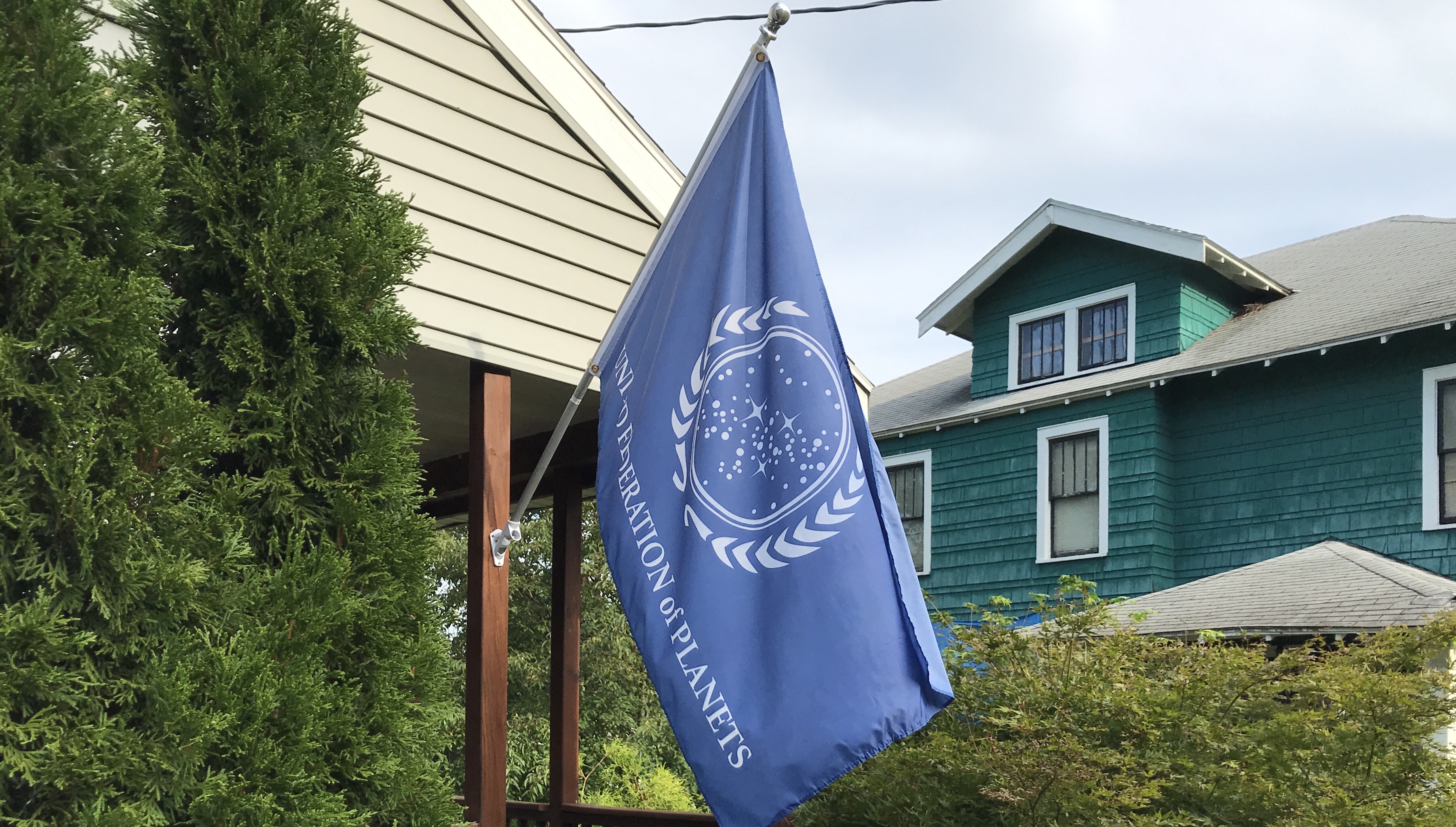
In our little corner of the Alpha Quadrant, we’re marking the occasion by flying the flag of the United Federation of Planets. We’ve flown the UFP flag before and you can read my original post about the flag here.
The UFP Flag and Beginning Vexillology
That post contains my thoughts on the flag. For today I thought we’d look at two precursors of the UFP flag and a proposed redesign. The UFP apparently had no flag in the Original Series. The Star Fleet Technical Manual (Joseph, 1975) had a Banner, which can be seen in “And The Children Shall Lead” and it had a seal shown here, possibly designed for the book cover. This seal would make a passable flag itself.


The first place we see an image similar to the “current” UFP flag is on a view screen in Star Trek the Motion Picture when Kirk addresses the crew. This same image is seen as a flag, draped across the Torpedo Tube at Spock’s funeral in The Wrath of Khan.

This clearly looks like a hybrid of the Tech Manual’s seal and the current flag design. There are two advantages over the current design for me. There’s no text and the wreath looks less like something of terrestrial origin.
The last image we’ll look at today is a proposed redesign of the UFP flag that I found on Reddit, created by Doliam13.

This fixes a lot of the issues with the current UFP flag. The text is gone and the star field is more symbolic, looking less like a literal map of our local piece of the Milky Way. This also fixes some of the symbolism in the current design. There are four stars to represent the four founding civilizations of the Federation where the current flag highlights only three. The notion that the three stars represent three of the founding worlds as seen by an observer standing on the fourth is an inane retcon contrivance. Better to just fix the flag and not try to explain it.
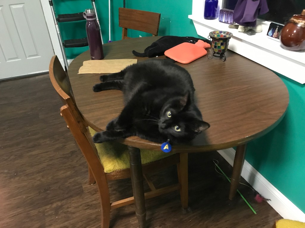
A few last things to mark the day. Science Officer Leonard (named for McCoy, Leonard H. Son of David) is properly attired and ready to face the day while I have two different pairs of let’s call them “Spocky socks” that I’ll wear throughout the occasion. The blue, black, and gold pair were made by my lovely wife, Joanne while the pair with the Vulcan salute was a gift from my sisters-in-law.

Also: Tea. Peppermint. Hot.


