A Flag for Elmira

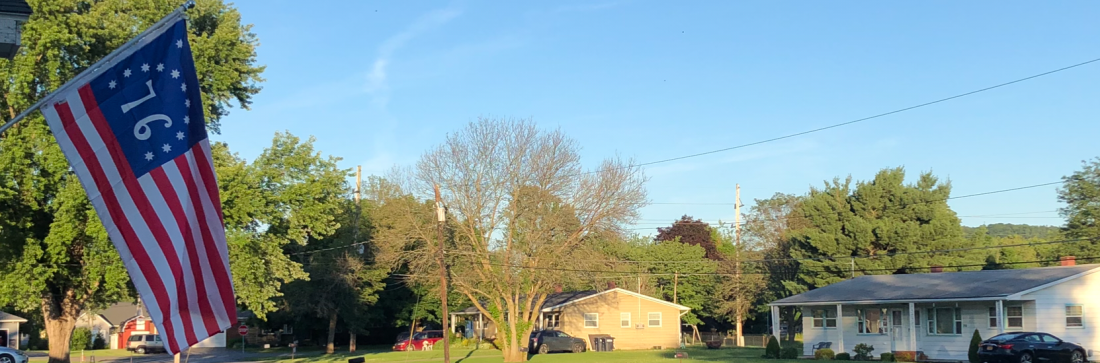
We’ve settled into the new house enough that we’ve finally installed the flagpole. That was a non-trivial project; there’s nothing like a simple task to remind you of your total lack of aptitude for all things handy. This is the first time we’ve lived in the City of Elmira; we’ve lived in Horseheads and Southport and Newfield, but not within the city itself. To mark the occasion, the first flag that we’re flying from our new home is a proposed flag for the City that was designed by Alex Chichester. Last month, I unboxed the very flag that we’re flying and provided links to Alex’s story, about the flag, why he designed it and some of the community’s response to the flag. You can find all of that here.

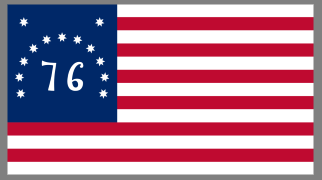
The current city flag can be seen to the right and it’s nice enough. I asked about purchasing a copy of this flag from the city and I may yet buy one, but to be honest, it’s somewhat bland. The seal is a standard, city seal, but it’s the sort of seal that’s designed for the printed page. It works best on letterhead or in a book where you can look at it carefully and appreciate all of the detail.

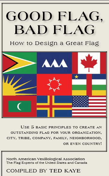
Today, I thought I’d look at the proposed flag, which I’m inclined to call the Chichester Flag through the lens of the North American Vexillological Association’s five principles for good flag design as delineated in Good Flag, Bad Flag. Alex’s design is an objectively good flag. Here we go!

Principle 1. KEEP IT SIMPLE: The Flag should be so simple that a child can draw it from memory.

Here the Chichester Flag shines. The basic design a purple background with a blue horizontal band across the center. Many flags have shared this basic design, which could also be described as three horizontal stripes in two colors. Latvia, Austria, and Cambodia among others, share this basic design. The two joined gold rings as well as the choice of colors make the flag stand out as distinct from the other flags with similar designs. Simplicity is important and it’s no coincidence that NAVA lists this principle first as flags are meant to be seen from a distance and to either drape or to move in the wind. The Confederate States of America had three national flags in its four years of existence because the first two were easily confused with other flags.

A few weeks ago, while I was driving, I encountered a good illustration of this principle as the car in front of me had a small Canadian Flag sticker on its rear window and it was recognizable as a Canadian Flag even when it was many car lengths ahead of us. You can see this in the leftmost picture below. I pasted the official Elmira flag (middle) and the proposed flag (right) into the same photo and the difference is evident. The proposed flag is recognizable while the official flag could be many other things at this distance, such as the flag of Anchorage, Alaska or Honolulu, Hawaii.

Principle 2. USE MEANINGFUL SYMBOLISM: The flag’s images, colors, or patterns should relate to what it symbolizes.

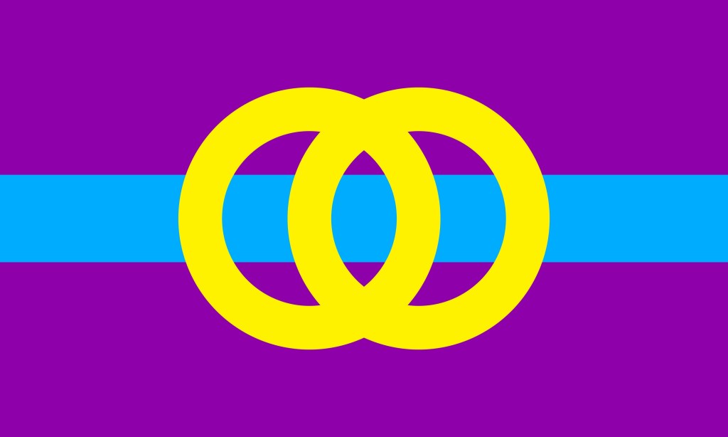
The Chichester Flag has nice clear symbolism. The blue band represents the Chemung river which runs through the city. This is apt; the original settlement in the area was founded at the meeting of the Chemung River and the Newtown Creek. It was the completion of the Chemung Canal that connected the Chemung River to Seneca Lake and ultimately to the Erie Canal System. This allowed Elmira to become a regional center of manufacturing and shipping. There is little doubt that the Chemung River had a profound influence on the city and the community.

The two golden interlocking rings represent the uniting of the city’s north, south, east and west sides into a single community. This works both figuratively and concretely as the four sections of the rings that cross the blue band can be seen to represent the four driving bridges that cross the river within the city.

The colors of the flag are also significant. The Elmira College colors are purple and gold and those colors are ubiquitous on campus. The college, which sits in the heart of the city was founded in 1855, nine years before the city was incorporated from the village and part of the town of the same name. The new flag’s designer, Alex said, “I personally identify the city with the color purple,… It’s probably a lot to do with Elmira College. Also, there’s purple and golden wildflowers all over town.”

The wildflower rationale is frequently echoed in stories about why the college chose purple and gold as their school colors, although those stories usually invoke irises, the school flower. The other reason the college usually shares as an inspiration for their choice of colors is that purple and gold were among the colors of the Women’s Suffrage Movement (you can read a bit more about that here). This reason might be even more salient. Elmira had significant links to the women’s movement and this includes the college itself, which was the first college in the U. S. to offer degrees to women that were equivalent to those that were being offered to men.

Elmira also played an important role in the abolitionist movement and the Underground Railroad. When we consider this along with the ties to the women’s movement, the fact that the purple portion of the flag evokes an equals sign (=), the flag elicits all of this history.

Principle 3. USE 2 TO 3 BASIC COLORS: Limit the number of colors on the flag to three, which contrast well and come from the standard color set.

There’s very little that needs to be said here; the flag contains three colors that contrast nicely. A useful measure of this is whether the flag remains recognizable and attractive when rendered in grayscale. It does. The black and white version remains both striking and distinctive.

As an interesting side note, the NAVA manual defines the basic color set as “red, blue, green, black, yellow and white” and states that other colors “are seldom needed in a good design.” At least part of the reason is that “flag fabric comes in a relatively limited number of colors.” I wonder if this is still true; it seems to me that printed flags have become more common and easily obtained in the 14 years since the manual was written. Either way, the connections between Elmira and the color purple are significant enough to warrant its use.

Principle 4. NO LETTERING OR SEALS: Never use writing of any kind or an organization’s seal.

This is strongly related to the “keep it simple” principle. Seals are difficult to see at a distance and text on printed flags appears reversed on the back, making it difficult to read. To make the text readable on both sides dramatically increases the cost of the flag. The Chichester flag has neither text nor a seal.

Principle 5. BE DISTINCTIVE OR BE RELATED: Avoid duplicating other flags, but use similarities to show connections.

[Iroquois Confederacy flag]

The Chichester flag can claim both of these characteristics. The color choices and the interlocking rings set the flag apart from other flags with similar designs making it distinctive while it shares some similarities to related flags. The similarities to the Elmira College flag, shown above, are evident. The gold rings can also be seen as an homage to the current Elmira flag as they share its color and evoke its main motif, the circular seal. In a nice coincidence, the purple color refers back to the flag of the Iroquois Confederacy, who inhabited this area of North America before the arrival of European settlers.

Final Words:

This was an enjoyable project and a nice inaugural flag for our new home. I’d never ordered a custom flag before, but the process was easy and straightforward. It’s easy enough that I will probably order more custom flags in the future, when I’m interested in flying something that isn’t easily available.

It is also been exciting to be able to fly a flag that, as far as I know, has never been flown before. That’s been a great deal of fun and I want to thank Alex for allowing me to use his design.

And speaking of Alex, I hope that his campaign to have his flag become the official flag of the City of Elmira is successful. It’s a beautiful flag and his arguments about using the flag to invigorate the community and brand the city deserve careful consideration. If you’re interested in such things, please check out his videos. I think you’ll find them compelling.

References:

Image Credits:

Coming Flag-tractions

In a couple of weeks, we’ll be moving into the city of Elmira. We’ve lived in the area for some time, but never actually in Elmira itself. To mark the occasion, we wanted an appropriate flag to fly for the first month or so in our new home.

Meanwhile, a young man named Alex Chichester has designed a new flag for the city and he’s been promoting it. It’s a lovely design and it deserves a chance to become our new flag. We decided to fly his flag when we moved to the city. I contacted Alex and he graciously allowed me to have a copy made. After speaking with a number of nice people, I decided to work with a company called Asley who produced a lot of the flags we’ve flown at home for the last year or so. The new flag finally arrived yesterday. Here’s our first look at the finished product.

I’ll have more to say when I start flying the flag, but if you’re interested, here are two of Alex’s videos regarding his flag. He promotes this better than I can.

And if this has piqued your interest in flags and vexillology, here’s an excellent TED Talk on city flags and flag design.

More soon (ish).

The Serapis Flag

The Serapis Flag

There are many variations of the United States Flag that were used in the early days of the republic. One of the more interesting is the Serapis Flag which we are now flying. Its existence is intimately tied to the Battle of Flamborough Head fought 240 years ago 0n 23 September 1779.

John Paul Jones

The story of the Serapis flag begins with the story of John Paul, a ship captain. Paul fled his native Scotland after killing a crewman who mutinied over wages, presumably refusing to trust his fate to an Admiralty Court. Paul emigrated to the colonies, renamed himself “John Paul Jones” and befriended Benjamin Franklin. He joined the Continental Navy, rose through the ranks and became the United States’ first famous naval commander. He is sometimes called the Father of the U. S. Navy. By 1779, Jones was in command of the Bonhomme Richard, named in honor Franklin’s pseudonym from Poor Richard’s Almanac.

The Serapis vs. the Bonhomme Richard

Bonhomme Richard was a former merchant ship that had been armed and upgraded to a ship of war. It led, under Jones’ command, a small squadron of ships. Near Flamborough Head, Yorkshire, this squadron encountered a British convoy under the protection of the HMS Serapis. Conflict ensued and Bonhomme Richard took severe damage from the better armed Serapis. When the British captain asked if the Richard had struck her colors (meaning that they had lowered their flag as a sign of surrender) Jones is said to have replied with the famous “I have not yet begun to fight!” The flag, in fact, had been destroyed in the battle.

Eventually, the tide of the battle turned and Jones managed to lash Bonhomme Richard to the Serapis. The American crew was able to board and capture the British ship while their own ship, badly damaged and on fire, sank into the North Sea.

But what does this have to do with the Serapis Flag? Only this. Jones, now in command of the Serapis, put into a neutral Dutch port for repairs. British officials accused Jones of being a pirate and demanded his arrest. He was, after all, sailing a captured ship which was not flying the colors of any known nation. Bonhomme Richard’s flag, remember, had been blown into the sea. A flag was hastily created for Jones’ ship and entered into the Dutch records, allowing the Dutch to officially recognize the captured ship.

The Serapis Flag was created according to a description of United States flag that was provided by Benjamin Franklin, who was then Ambassador to France.

“It is with pleasure that we acquaint your excellency that the flag of the United States of America consists of thirteen stripes, alternately red, white, and blue; a small square in the upper angle, next the flagstaff, is a blue field, with thirteen white stars, denoting a new constellation.”

The Revolutionary Diplomatic Correspondence of the United States

And thus, this slightly garbled recounting of the Flag Resolution of 1777 is responsible for the distinctive look of the Serapis Flag. Because of this, the flag is also known as the Franklin Flag. It remains popular today and is frequently used in historical displays because of its uniqueness and its recognizably American character.

References:

Picture Credits:

19th Amendment Victory Flag

It was 99 years ago today, 18 August 1920, that Tennessee became the 36th state to ratify the 19th Amendment, and the United States officially recognized women’s right to vote. Today, we’re flying a “19th Amendment Victory Flag” to mark the occasion.

The road to passage was a long one. Universal suffrage for white men was, mostly, completed by the 1830s. The Women’s Rights Movement began in the decades before the Civil War and was organized nationally in 1848 at the Seneca Falls Convention, led by Elizabeth Cady Stanton and Lucretia Mott. In 1869, the Wyoming Territory extended voting rights to women and retained the provision when it became a state in 1890. Colorado (1893), Utah (1896) and Idaho (1896) followed suit. Still, by 1900, only these four states recognized voting rights for Women; a fact immortalized in the “Women’s Suffrage Flag” shown below.

This remained the status quo until 1910 when Washington State expanded voting rights, paving the way for other states to follow. In January 1917 the Women’s Rights Party, led by Alice Paul, began posting “Sentinels of Liberty” in front of the White House. These women stood in silence, holding flags and banners quoting President Wilson’s own words about liberty.

In return, these women were spat upon and subjected to ridicule, violence and arrest. But the movement was taking hold. In 1918 the arrests were ruled unconstitutional and Wilson declared his support for suffrage. The following year the Suffrage Amendment passed both houses of Congress with the required two-thirds vote and was sent to the states for ratification.

Alice Paul adds a star to the Victory Flag.
Library of Congress Collection

Thirty-five states had approved the amendment by March 22nd, 1920 but there the process stalled, just one state short of ratification. Worse, of the thirteen states remaining, eight states had already rejected the amendment, Georgia, Alabama, South Carolina, Virginia, Louisiana, Maryland, Mississippi and Delaware. Things didn’t look promising when Tennessee took up the amendment on August 18th; most of the other southern states had voted to reject. With less than three months to go before the 1920 election, three states were called upon to hold special sessions to approve the amendment and refused. Only Tennessee’s legislature was still in session; this could be the last chance to ratify before the election. The Tennessee Senate passed the amendment.

The Flag of the National Women’s Party
The Victory Flag is revealed upon passage.
Library of Congress Collection

Enter Phoebe King “Febb” Ensminger Burn, mother of Harry T. Burn who at 25 was the youngest member of the state legislature. Mrs. Burn, inspired by a political cartoon, wrote her son a long letter, “Hurrah and vote for Suffrage and don’t keep them in doubt,” she wrote. “I’ve been watching to see how you stood but have not seen anything yet.” Referencing the cartoon, she continued, ”Don’t forget to be a good boy and help Mrs. Catt put the RAT in ratification.” Harry had originally intended to vote for ratification, but after pressure from party leaders and receiving “misleading telegrams from his constituents” he joined the anti-suffrage side. This left the state legislators tied with 48 votes for ratification and 48 votes for rejection. When the Legislature met, Harry had his mother’s letter in his coat pocket. The first vote went as expected, 48 to 48. At least two votes to table the matter failed and the another vote was called on the merits, Harry addressed the assemblage. ”I know that a mother’s advice is always safest for her boy to follow,” he told his colleagues. He then changed his vote and the Women’s Suffrage Amendment became part of the constitution.

The 19th Amendment Victory flag is based on the flag of the National Women’s Party, which is a horizontal tricolor using the Party’s three official colors. The meanings of the color’s were explained in the Suffragist in December 1913.

“Purple is the color of loyalty, constancy to purpose, unswerving steadfastness to a cause. White, the emblem of purity, symbolizes the quality of our purpose; and gold, the color of light and life, is as the torch that guides our purpose, pure and unswerving.”

To create the victory flag, two rows containing 18 five-pointed stars each were added to represent the thirty-six states who had ratified the Amendment prior to passage. Every state has now ratified the 19th Amendment, the last being Mississippi on 22 March 1984.

References:

Image Credits:

  1. Featured Image: ComicsTheUniverseAndEverything.net
  2. Woman Suffrage Flag
  3. Suffragette Flags
  4. http://library.austintexas.gov/ahc/votes-women-54444

One Giant Leap for Mankind

Today is 20 July 2019; fifty years to the day that humans first set foot on another celestial body marking the culmination of the Space Race and one of humanity’s greatest technological achievements.

To commemorate the occasion, we’re flying a flag featuring the NASA Insignia, a streamlined version of the NASA seal. Other than the the fact that it contains text, the insignia is a perfect centerpiece for a flag. It’s striking without being too busy and it’s easy to sketch. It also has nice, clear symbolism.

From the NASA website:

The round red, white and blue insignia, nicknamed the “meatball,” was designed by employee James Modarelli in 1959, NASA’s second year. The design incorporates references to different aspects of the mission of the National Aeronautics and Space Administration. The round shape of the insignia represents a planet. The stars represent space. The red v-shaped vector represents aeronautics. The circular orbit around the agency’s name represents space travel.

The Symbols of NASA
The NASA insignia and the more formal seal

We spent a decent amount of time deciding which flag to fly for the occasion. Our first thought was the Earth Day flag, and then an Earth Day flag with a stylized crescent moon and the southern cross, but neither of those seemed to feature the Moon clearly enough. There were other options, but the NASA flag seemed most appropriate.

The first two options above could be deemed “photograph flags” and, for my purposes, flying a flag based on a photograph seems fine. If any of the images below were available in flag form, we might have chosen it. Perhaps I’ll order one of these custom made for the 51st anniversary.

The flag played a prominent role in the Lunar Landing. One of the more dramatic moments was the raising of the flag, which I can clearly remember seeing on the teevee. I explicitly recall being puzzled about the flag’s behavior. It seemed to snap out with the top sticking straight out from the pole. I was only five, but this seemed strange. I’d seen flags before and they certainly didn’t do this. It must be something strange about space, I thought. Or the Moon. Or something else. Here’s the news footage.

Astronauts Plant the American Flag on the Moon.

Turns out the flag had its own “frame.” Five year old me missed that. If you have any doubts about the significance of the flag in this event, let’s turn to Arthur C. Clarke’s July 20, 2019: Life in the 21st Century. Published in 1986, this book is a collection of Clarke’s speculations about the state of life and technology on this very day. The first chapter is a fictional letter, written by Clarke himself, from his home in Clavius City, Luna on the book’s titular date. It begins thusly.

It doesn’t seem like fifty years – but I cannot be sure which memories are false and which are real. Present and past are inextricably entangled. The monitor screen has just shown the ceremony at Tranquility Base, culminating with the third hoisting of the American flag. It was blown down, of course, by the blast of the Eagle’s ascent stage, and lay there on the trampled Moon soil for thirty-six years until the Apollo Historical Committee reerected it. Then the big quake of 2009 knocked it down again; this time, we’re assured, it would take a direct hit by a fair-sized meteor to lower it…

Arthur C. Clarke’s July 20, 2019: Life in the 21st Century

It’s a romantic image; historical societies reerecting and preserving the flag for future generations to see and enjoy, but sadly, that may never come to pass. The condition of the flags on the moon is a subject of speculation. The conditions are harsh. The surface is bombarded with UV radiation without the protection we receive from Earth’s atmosphere and the temperature ranges from -280 to +240 degrees Fahrenheit. Some of the flags could have disintegrated entirely. At a minimum, the flags must be so sun bleached that they are now completely white. At least as recently as 2012, however, there was evidence that the flags of Apollo 12, 16 and 17 were still standing. You can read about the condition of the flags in the links below.

References:

Happy 4th of July! Bennington Flag

A picture of the Bennington Flag.

Happy Independence Day everyone! Last year to celebrate, we flew the Betsy Ross flag. This year we’re flying what is, at least according to legend, another Revolutionary War flag, the Bennington Flag. Legend has it that this flag was flown by General John Stark and his men at the Battle of Bennington, which happened in Walloomsac, New York on 16 August 1777. General Stark’s forces, including troops from the Republic of Vermont, defeated the British forces under the command of Lt. Colonel Friedrich Balm. This was a turning point in the war, leading to the defeat of the British at the Battles of Saratoga.

So, the Bennington Flag is purportedly an “early US” flag that stands beside many others. The “Betsy Ross” flag is probably the most recognizable but others include the Cowpens Flag (below, right) and the flag designed by Francis Hopkins for the US Navy which used 6-pointed stars and arranged the stars in rows with a 3-2-3-2-3 pattern.

Two Early US Flags

Why so many? Well, on 14 June the Second Continental Congress passed the Flag Resolution of 1777.

Resolved: That the flag of the United States be thirteen stripes, alternate red and white; that the union be thirteen stars, white in a blue field, representing a new constellation.

This leaves a lot unspecified, namely the arrangement and orientation of the stars, the kind of star, the size of the union (or “canton”), and whether there are 7 red stripes or 7 white stripes. Individual flag makers made their own decisions on these points. That led to a plethora of variants. The Bennington Flag mostly adheres to the Flag Resolution with some distinctive variations, including the arrangement of the stars inside a canton that is taller than it is wide. The choices to make the outer stripes white and to use 7-pointed stars are also uncommon. The one departure is the addition of the large “76” in the canton to reference the passage of the Declaration of Independence.

The legend claims that the original Bennington Flag was flown at its namesake battle and was carried off the battlefield by Nathanial Fillmore He passed the flag onto his nephew, Septa Fillmore who carried it in the Battle of Plattsburg, the turning point in the War of 1812. Subsequently, the flag was passed down to other relatives including President Millard Fillmore and Philetus Fillmore who flew the flag during the centennial celebrations for American Independence and the Battle of Bennington. Because of its close affiliation with the family, this flag is also called “the Fillmore Flag.” If I were determining the nomenclature, I’d probably keep the term “Fillmore Flag” for the original flag that now resides in the Bennington Museum.

The Green Mountain Boys Flag

That Fillmore Flag was examined by Grace Rogers Cooper, Curator of Textiles at the Smithsonian Institution. She determined it to be of 19th-century origin and dated it to around 1820. The flag itself is made of cotton and sewn with cotton thread neither of which would have been readily available in 1777. Various theories exist as to its possible origin; it may have been made during the War of 1812 to evoke the spirit of the Revolution or it may have been made to celebrate the visit of Lafayette to the US in 1824 or the semicentennial of the signing of the Declaration of Independence. One thing that’s generally agreed upon is that that particular flag could not have been at the Battle of Bennington. What was flown at the battle? The “Green Mountain Boys Flag” shown above, is a regimental standard known to have been flown by General Stark and his men. The Green Mountain Boys Flag is currently the flag of the Vermont National Guard.

References:

Picture Credits:

A Flag of which to be Proud

Hetero flag

It’s Pride Month and so we’re flying a “Straight Ally” flag to show our support. I’m not wild about the flag itself. The stylized “A” for ally with the rainbow motif is both perfect and visually striking. Unfortunately, the background lessens the effect somewhat; the

Friz Freleng | Dr. Grob's Animation Review

black and white strips remind me of an old-style prison uniform and it has a lot of contrast. Because of this, the rainbow doesn’t stand out as well as I would have liked. I probably wouldn’t have thought about it quite so much but the first version of the Ally flag that I saw had graduated shades of gray in the background and looked better. But the marketplace once again has spoken to choose the version I don’t like as well.

Of course, the Ally flag is a derivative of the traditional LGBT Pride Flag which was designed by Gilbert Baker and first flown in San Francisco in 1978. The rainbow may have been inspired by Judy Garland’s “Over The Rainbow.” Interestingly the flag originally consisted of eight stripes representing sexuality, life, healing,

sunlight, nature, magic & art, serenity, and spirit. Over time, the number of stripes was reduced to the six we see on the ally flag. We’ve never gotten a complete spectrum on any version of the flag but you have to admit, as a metaphor for inclusiveness, it’s hard to go wrong with a rainbow.

It seems like the Pride Flag is in the process of increasing the number of colors again. There’s a new version that adds stripes to support people of color and another that adds a white stripe to represent the full spectrum of gender and sexuality as well as “peace and union among all.”

The Ally flag always puts me in mind of a joke from “Dimitri Martin: Person” which is pretty funny. Interestingly, the first thing I found when I was looking for this clip was a discussion of whether or not the shirt described in the bit would be offensive. I hope not; as a society, we currently seem to be actively seeking things to offend us and that isn’t healthy.

Refracted Light

References:

https://en.wikipedia.org/wiki/Rainbow_flag_(LGBT_movement)#Rainbow_colors_as_symbols_of_LGBT_pride

Happy Earth Day

Well, the UFP Flag didn’t end up being flown for very long. We’re now flying the Earth Day flag that was designed by John McConnell, founder of Earth Day in 1969. This version of the flag features the famous photograph of the Earth that was taken from the Apollo 17 spacecraft. The original version was screen printed; but both were official Earth Day promotional items used to advertise the occasion.

The flag I’d originally wanted to fly for Earth Day is the “Flag of the Earth,” (shown below) that was designed by James W. Cadel. It shows a stylized collection of the Earth, Moon and the sun. It flies at Observatories and SETI installations world wide.

References:

The Flag of the Earth


The UFP Flag and Beginning Vexillology

We’re flying a new flag this morning; specifically the flag of the United Federation of Planets. It flew for a day a few weeks ago, but it was wet and windy and the flag kept getting tangled around the pole so I decided to take it down for a bit.

In the meantime, we purchased a Valley Forge Tangle-Free Aluminum Pole (not pictured above) from the Horseheads Do It Center. It’s working beautifully so far. The flag is affixed directly to the pole through the grommets and the entire top section of the pole rotates freely. The weight of the flag itself keeps it from wrapping around the pole.

I like this flag, however, it puts me in mind of a lot of state flags, most of which are pretty dreadful. I, therefore, thought I’d look at it in terms of the North American Vexillological Association’s criteria for evaluating/creating flags.

NAVA’s five criteria for creating a good flag were first codified in 2001 when they conducted a survey to choose the best and worst flags on the continent. These are:

  1. The design of the flag should be simple enough that a child could draw it from memory.
  2. It should use clear and understandable symbolism.
  3. The flag should use common colors; probably no more than four different ones.
  4. Both text and seals should be avoided.
  5. Finally, the flag should be unique as it represents a distinct entity. It can however, show similarities to other flags, to show connections.

A nice example of the last criterion is the similarities between the flags of Ohio and the United States. The flags are distinct but the common elements make it clear that the US and Ohio are closely related.

Flag of  Nebraska

We could segue into a long discussion of state and province flags, but we’ll save that for another day. The existing state flag closest to the bottom of the NAVA survey was Nebraska.

Flag of  Alaska

The dubious distinction for last place was given to Georgia, but that flag was changed in 2003. Meanwhile, my favorite state flag has to be Alaska; simple and elegant with clear symbolism. It’s a classic.

The UFP flag fares pretty well according to the NAVA standards. The design is simple and clean. The colors, blue and white are classic and attractive. The weakest element of the flag is the text. Like the conventional wisdom assumes, it’s difficult to read as the flag waves in the wind, especially as the text is backward on one side of the flag. It’s also an odd choice; the Federation contained over 150 member worlds at one point, each of which probability had its own language. I think it remains an odd choice even though English had evolved into “Federation Standard.”

Flag of the United Nations.svg

To think about the symbolism, it makes sense to look back to the obvious inspiration for the UFP flag, the Flag of the United Nations. The blue color was chosen in contrast to “red, the war color.” The world map represents all the people of the world. The map projection is surrounded by olive branches, a common metaphor for peace.

The similarities to the UFP flag are striking and the symbolism transfers in a straightforward manner. The branches are similar, though may not be of terrestrial origin. The galactic map with the density of the stars in an off-center diagonal line is evocative of a section of one of the spiral arms of the galaxy.

Here's what the Milky Way may look like from deep space ...

Earth and presumably most of the other member worlds of the Federation are located in the Orion Spur, a minor arm of the Milky Way, which exists between the Perseus and Sagittarius Arms of the galaxy. In-universe and otherwise, the similarities between the UFP flag and the UN flag make sense since one organization is clearly an inspiration for the other. If the UN still existed in the 23rd Century, the two flags might be too similar to be flown together, but I suspect the UN flag has been supplanted by a “United Earth” flag.

One place where the symbolism of the UFP flag seems lacking is that there are three stars in the galactic map that are stylized as four-pointed stars rather than circles. These stand out and in a standard flag, these might represent the founding worlds of the Federation. Unfortunately, there are four; Earth, Vulcan, Andor, and Tellar Prime. This is not surprising. The UFP flag was designed long before the founding worlds were codified in “These are the Voyages…” the series finale of Star Trek: Enterprise. I might be inclined to add a fourth four-pointed star.

References:

Happy Thanksgiving! Great Star Flag.

Happy Thanksgiving everyone!

35-Star US Flag

It’s been awhile since I changed the flag outside and I decided to swap for today, in honor of the holiday. Specifically, we’re now flying a 35-Star American Flag with the stars in what is known as a great star configuration.

The 35-Star Flag became the official flag of the United States on 4 July 1863 when a star was added for West Virginia. It remained the official flag until 1865 when the 36th Star was added to represent Nevada.

The relevance to Thanksgiving Day? Although the holiday was celebrated at various times prior to 1863, the modern celebration dates back to 1863 when Abraham Lincoln called for a National day of Thanksgiving on the last Thursday of November. This was the national flag on that day.

There doesn’t seem to be a lot of historical evidence for a 35-Star flag with a great star configuration, most show the stars in a rectangular array. Congress doesn’t typically specify the configuration of the stars, but there were 20, 26, 33, 34 and 36-Star Great Star variants. Great stars were popular and commonly flown on private ships in the early part of the 19th Century.

The closest historical flag that I can find to the version I’m flying was one of many mourning flags for Abraham Lincoln.  This one had an additional star in the center of the great star and a black border. According to loeser.com,

It should be understood that these special flags are only examples because the engines were switched as the train was passed from railroad to railroad. There were at least five or more different engines used to pull the train on its journey, plus more pilot locomotives that ran the tracks ahead of the actual train to make sure the tracks were clear. Each railroad used their best and most powerful engines to move the funeral train slowly from station to station and they each decorated their engines differently with locally made flags…

Other sources indicate that this flag was used for later periods of national mourning, including for President Kennedy in 1963.

References: