We’ve settled into the new house enough that we’ve finally installed the flagpole. That was a non-trivial project; there’s nothing like a simple task to remind you of your total lack of aptitude for all things handy. This is the first time we’ve lived in the City of Elmira; we’ve lived in Horseheads and Southport and Newfield, but not within the city itself. To mark the occasion, the first flag that we’re flying from our new home is a proposed flag for the City that was designed by Alex Chichester. Last month, I unboxed the very flag that we’re flying and provided links to Alex’s story, about the flag, why he designed it and some of the community’s response to the flag. You can find all of that here.

The current city flag can be seen to the right and it’s nice enough. I asked about purchasing a copy of this flag from the city and I may yet buy one, but to be honest, it’s somewhat bland. The seal is a standard, city seal, but it’s the sort of seal that’s designed for the printed page. It works best on letterhead or in a book where you can look at it carefully and appreciate all of the detail.

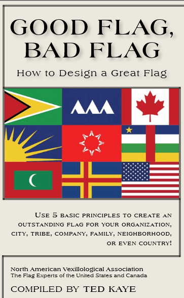
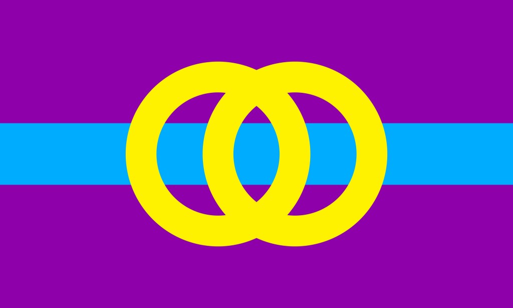
Today, I thought I’d look at the proposed flag, which I’m inclined to call the Chichester Flag through the lens of the North American Vexillological Association’s five principles for good flag design as delineated in Good Flag, Bad Flag. Alex’s design is an objectively good flag. Here we go!
Principle 1. KEEP IT SIMPLE: The Flag should be so simple that a child can draw it from memory.
Here the Chichester Flag shines. The basic design a purple background with a blue horizontal band across the center. Many flags have shared this basic design, which could also be described as three horizontal stripes in two colors. Latvia, Austria, and Cambodia among others, share this basic design. The two joined gold rings as well as the choice of colors make the flag stand out as distinct from the other flags with similar designs. Simplicity is important and it’s no coincidence that NAVA lists this principle first as flags are meant to be seen from a distance and to either drape or to move in the wind. The Confederate States of America had three national flags in its four years of existence because the first two were easily confused with other flags.
A few weeks ago, while I was driving, I encountered a good illustration of this principle as the car in front of me had a small Canadian Flag sticker on its rear window and it was recognizable as a Canadian Flag even when it was many car lengths ahead of us. You can see this in the leftmost picture below. I pasted the official Elmira flag (middle) and the proposed flag (right) into the same photo and the difference is evident. The proposed flag is recognizable while the official flag could be many other things at this distance, such as the flag of Anchorage, Alaska or Honolulu, Hawaii.

Principle 2. USE MEANINGFUL SYMBOLISM: The flag’s images, colors, or patterns should relate to what it symbolizes.

The Chichester Flag has nice clear symbolism. The blue band represents the Chemung river which runs through the city. This is apt; the original settlement in the area was founded at the meeting of the Chemung River and the Newtown Creek. It was the completion of the Chemung Canal that connected the Chemung River to Seneca Lake and ultimately to the Erie Canal System. This allowed Elmira to become a regional center of manufacturing and shipping. There is little doubt that the Chemung River had a profound influence on the city and the community.
The two golden interlocking rings represent the uniting of the city’s north, south, east and west sides into a single community. This works both figuratively and concretely as the four sections of the rings that cross the blue band can be seen to represent the four driving bridges that cross the river within the city.
The colors of the flag are also significant. The Elmira College colors are purple and gold and those colors are ubiquitous on campus. The college, which sits in the heart of the city was founded in 1855, nine years before the city was incorporated from the village and part of the town of the same name. The new flag’s designer, Alex said, “I personally identify the city with the color purple,… It’s probably a lot to do with Elmira College. Also, there’s purple and golden wildflowers all over town.”
The wildflower rationale is frequently echoed in stories about why the college chose purple and gold as their school colors, although those stories usually invoke irises, the school flower. The other reason the college usually shares as an inspiration for their choice of colors is that purple and gold were among the colors of the Women’s Suffrage Movement (you can read a bit more about that here). This reason might be even more salient. Elmira had significant links to the women’s movement and this includes the college itself, which was the first college in the U. S. to offer degrees to women that were equivalent to those that were being offered to men.
Elmira also played an important role in the abolitionist movement and the Underground Railroad. When we consider this along with the ties to the women’s movement, the fact that the purple portion of the flag evokes an equals sign (=), the flag elicits all of this history.
Principle 3. USE 2 TO 3 BASIC COLORS: Limit the number of colors on the flag to three, which contrast well and come from the standard color set.

There’s very little that needs to be said here; the flag contains three colors that contrast nicely. A useful measure of this is whether the flag remains recognizable and attractive when rendered in grayscale. It does. The black and white version remains both striking and distinctive.
As an interesting side note, the NAVA manual defines the basic color set as “red, blue, green, black, yellow and white” and states that other colors “are seldom needed in a good design.” At least part of the reason is that “flag fabric comes in a relatively limited number of colors.” I wonder if this is still true; it seems to me that printed flags have become more common and easily obtained in the 14 years since the manual was written. Either way, the connections between Elmira and the color purple are significant enough to warrant its use.
Principle 4. NO LETTERING OR SEALS: Never use writing of any kind or an organization’s seal.
This is strongly related to the “keep it simple” principle. Seals are difficult to see at a distance and text on printed flags appears reversed on the back, making it difficult to read. To make the text readable on both sides dramatically increases the cost of the flag. The Chichester flag has neither text nor a seal.
Principle 5. BE DISTINCTIVE OR BE RELATED: Avoid duplicating other flags, but use similarities to show connections.

![[Iroquois Confederacy flag]](https://www.crwflags.com/fotw/images/x/xa-iroqu.gif)
The Chichester flag can claim both of these characteristics. The color choices and the interlocking rings set the flag apart from other flags with similar designs making it distinctive while it shares some similarities to related flags. The similarities to the Elmira College flag, shown above, are evident. The gold rings can also be seen as an homage to the current Elmira flag as they share its color and evoke its main motif, the circular seal. In a nice coincidence, the purple color refers back to the flag of the Iroquois Confederacy, who inhabited this area of North America before the arrival of European settlers.
Final Words:
This was an enjoyable project and a nice inaugural flag for our new home. I’d never ordered a custom flag before, but the process was easy and straightforward. It’s easy enough that I will probably order more custom flags in the future, when I’m interested in flying something that isn’t easily available.
It is also been exciting to be able to fly a flag that, as far as I know, has never been flown before. That’s been a great deal of fun and I want to thank Alex for allowing me to use his design.
And speaking of Alex, I hope that his campaign to have his flag become the official flag of the City of Elmira is successful. It’s a beautiful flag and his arguments about using the flag to invigorate the community and brand the city deserve careful consideration. If you’re interested in such things, please check out his videos. I think you’ll find them compelling.
References:
- Kaye, Ted, Good Flag, Bad Flag, NAVA, 2006
- List of National Flags by Design, accessed 1 December 2019
- Category:Yellow flags, accessed 1 December 2019
- Elmira, New York, accessed 1 December 2019
- Chemung Canal, accessed 1 December 2019
- Chemung River, accessed 1 December 2019
- Underground Railroad Participants, accessed 2 December 2019
- Iroquois, accessed 2 December 2019
- Iroquois Confederacy (U.S. and Canada), accessed 2 December 2019
Image Credits:
- Chichester Flag, (c) 2019 Alex Chichester, used with permission.
- Elmira City Flag, Wikipedia, Public Domain
- Iroquois Flag, CRW Flag World, Fair Use
- U. S. and Elmira College Flag, Elmira College Flickr, cropped, Creative Commons License
- Other images (c) 2019, ComicsTheUniverseAndEverything.net

