It’s hard to believe it’s been a year since my last vexillological post, so much for picking up the pace. Still, Flag Day calls for a special effort!
Mostly this year, we’ve been flying flags I’ve already written about. There was the Maine 1901 flag over the holidays, and then the Flag of the Earth for Earth Day. Until yesterday we were flying the Ally flag for Pride Month. That one didn’t get to fly for long; June is a busy month for flag-related events. Juneteenth is right around the corner.
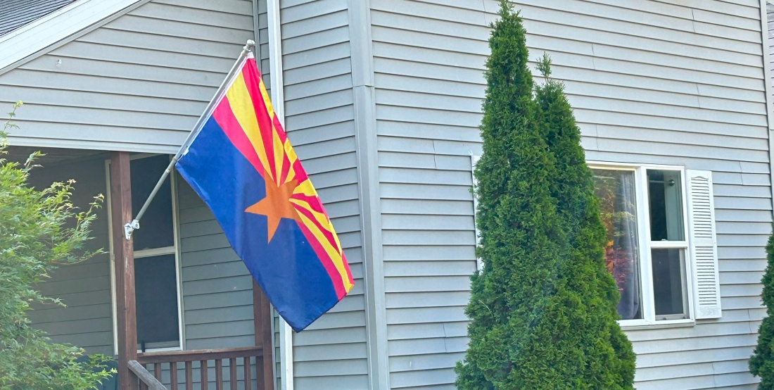
So, today, for Flag Day, we’re flying the Arizona State Flag for the first time. That gives us an opportunity for another installment of our series on State Flags.
Arizona was one of the first flags I intended to write about in this series. I was reminded of this recently when the Facebook group U.S. State Flags – Current, Historical, and Proposed had an extensive conversation about the Arizona flag’s design.
The Arizona flag depicts a copper-colored star representing a setting sun and, by extension, Arizona’s status as a western state within the US. The upper half of the flag shows thirteen rays, alternating red and weld-yellow honoring the original thirteen states of the US. The lower half of the flag is Liberty Blue. The red and blue colors on the flag match those on the US flag. The copper of the star honors Arizona’s position as the largest producer of copper in the United States.
You might notice that this is a lovely flag. It embodies all 5 of the North American Vexillological Association’s five principles of good flag design. In fact, NAVA chose it as the sixth-best flag from the continent in a 2001 poll. So why wasn’t it included in our first entry which encompasses the nine best state flags?
Recall, In our first installment, we decided to divide the US state flags into four categories:
Flags that need no changes,
Flags that only need very slight changes,
Flags that have well-established, aesthetic alternatives, and
Flags that require significant changes.
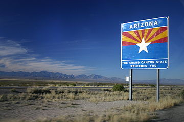
Arizona is our first flag in category two, it’s nearly perfect, but there’s one thing to fix. The flag needs more contrast and, as evidenced by this road sign I suspect that someone in the Arizona Department of Transportation thinks so too.
So, here’s my tweak and I make no claims of originality; it’s a straightforward adaptation and many others have hit on the same or similar ideas. For all I can remember, that road sign might have been my inspiration.
To get the needed contrast, we take a different color from the Stars and Stripes and make the star white. That though, takes away the most Arizona-specific color from the flag and thus we change the red stripes to copper. That’s it. We get a flag that’s a near equivalent to the current version with two colors and a five-pointed star from the national flag, thirteen rays to represent the thirteen original colonies and the color copper to symbolise, well, copper. All the symbolism remains intact.
My first version is on the left, above. That’s a nice flag and there is plenty of contrast; the weld-yellow is rich enough that the white star doesn’t fade into the background. The copper and gold rays feel more evocative of sunlight to me. Alan Hardy of the State Flags Facebook group suggested swapping the red and yellow rays so I tried this with that design as well, on the right. That’s nice too; I’m not sure which I like better.
Also, if you’re wondering, this was the winner of the Redesign Study on Facebook. That was an interesting flag study to follow. Usually studies work on terrible, awful, no good, very bad flags and the suggestions are all over the place. This one though started with a near perfect flag. The proposals showed that as most, like mine were minor variations on an excellent theme.
I thought about starting this post by pondering the efficacy of having recurring columns on a blog and, well, a job, but it seems like I began the last installment, written, in part, on Flag Day last year, with just that sort of disclaimer. I’ll try to pick up the pace.
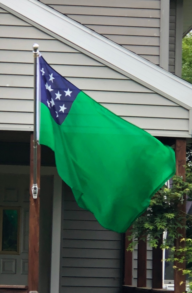
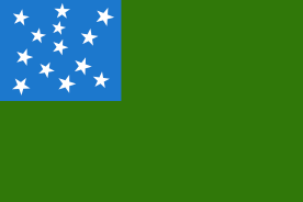
We’re flying the flag of “the Green Mountain Boys” this year which is possibly the most recognizable regimental flag of the Revolutionary War. It was likely flown at the Battle of Bennington in 1777 by John Stark.
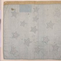
At least, there is a fragment of a flag that was flown by Stark at that battle in the Bennington Museum. It’s the canton of the flag with what appears to be remnants of green silk on three sides. But the flag as we have it today is a reconstruction; its connection to the Green Mountain Boys and its relation to Vermont are disputed.
The Fragment of Stark’s flag from the Bennington Museum
Other sources suggest that The Green Mountain Boys’ flag was the unofficial flag of the Vermont Republic and served as the unofficial state flag from Vermont’s admission to the union in 1791 to 1804.
So, how does this fit into our series on State Flags? If you recall our first installment, we’re dividing the US state flags into four categories
Flags that need no changes
Flags that only need very slight changes
Flags that have well-established, aesthetic alternatives and
Flags that require significant changes.
The Green Mountain Boys’ flag fits firmly into category three even if its early history is unclear. Multiple proposals have tried to revert the design of the state flag to the Green Mountain design, but none have been successful. That though is enough for me to consider it a “well-established” alternative.
Is it aesthetic? I think so, even if it is a bit bland. The thirteen stars in a “natural arrangement” sets it apart from other flags with stars in the canton and the green field is appropriate for the “Green Mountain State.” I won’t list them here but it easily clears the NAVA’s five principles of good flag design.
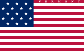
Consider the history of the Vermont flag. The Green Mountain Boys’ flag was the unofficial state flag from Vermont’s admission to the union in 1791 to 1804 when Vermont’s “second state flag” was adopted. There were 17 states at this time and the designers decided that adding stripes as well as stars was still a pretty neat idea (it wasn’t), this banner consists of 17 stars and 17 stripes. To distinguish this from a theoretical national flag, “Vermont” is written across the uppermost stripe. The third state flag, adopted in 1837, reverted to thirteen red and white stripes but had a single eight-pointed star in the canton, surrounding the pastoral scene from the center of Vermont’s coat-of-arms. On 1 June 1923, almost exactly 100 years ago, Vermont their current flag, consisting of the state coat-of-arms on a field of azure.
Among the three official state flags, two are strikingly similar to the United States flag (or perhaps Liberia’s). The third is a classic seal on a bedspread. While the Green Mountain Boys’ flag isn’t necessarily the quintessential flag for the state of Vermont, in this company it is the clear choice.
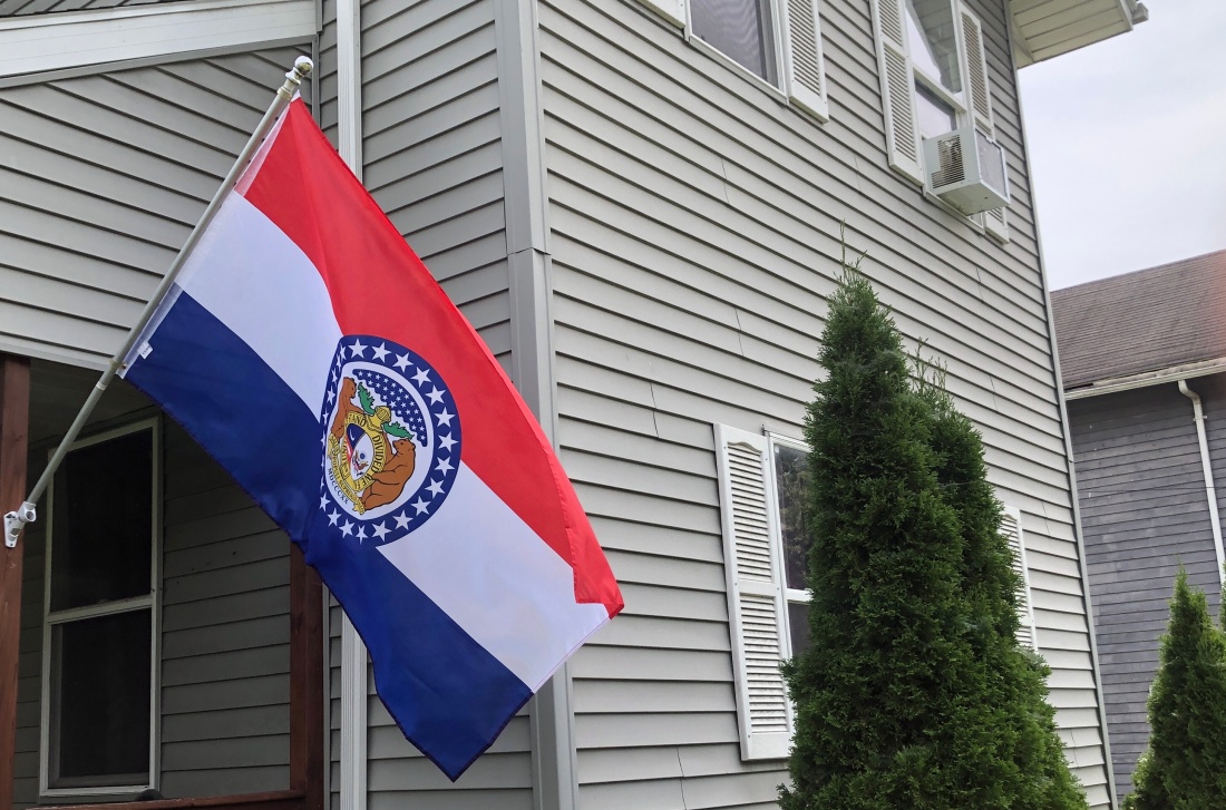
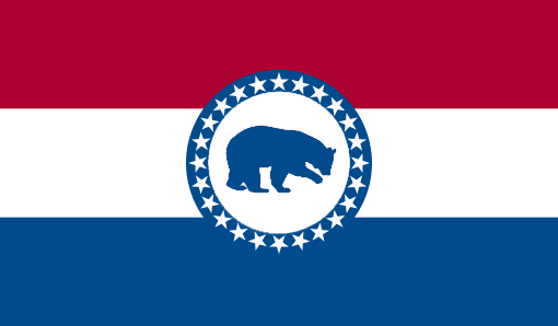
Happy (belated now) Flag Day 2022! We’re flying the Missouri state flag for the occasion.
Columns. They seem like a good idea at the time, but then things get busy and you start to feel self-consciously like Doctor Who (the program). It’s been altogether too long since your last episode and you’re hoping that people are going to lose interest. But you have a season of Sherlock to do, or whatever it is that Chris Chibnall did in between seasons. You get the idea.
Without further ado, here’s our latest installment on State Flags. If you recall our first installment, we’re dividing the US state flags into four categories
Flags that need no changes
Flags that only need very slight changes
Flags that have well-established and aesthetic alternatives and
Flags that require significant changes.
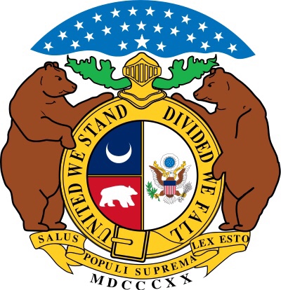
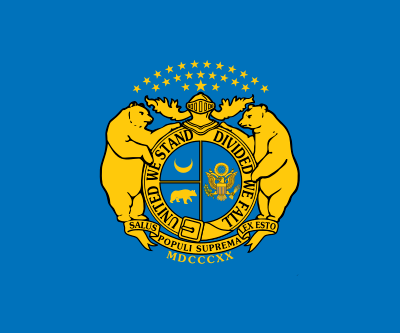
The Great Seal of Missouri
We’ve run through the top category in our first two installments but today we’re jumping ahead to category four because we’re flying the Missouri flag as we did for the Bicentennial of Missouri becoming a state last August when I started this post.
You might recall that Missouri was admitted to the union as part of the Compromise of 1820. It was a very similar situation to today. Today a potential state can’t become a state, even if it makes perfect sense for it to be one because it’s likely to elect Senators and Representatives from the wrong party. It was the same deal in 1819 except we cared about whether a state would support slavery or not. The Compromise of 1820 allowed Missouri and Maine to enter the union together one as a free state, the other as a slave state.
The Union Civil War Banner
It took nearly a century for Missouri to adopt a state flag although there were many unofficial flags flown by Missouri regiments fighting on both sides of the Civil War. These included flags with the state’s Great Seal in gold on a blue background, which is a quintessential seal on a bedsheet. The confederate version of this flag has the cloud of stars reduced to just a single star to symbolize Missouri as an independent state.
The creation of the official state flag started in 1908 when the Daughters of the American Revolution in Cape Girardeau noticed the need for a state flag. They set up a committee and appointed Marie Elizabeth Oliver its chair. Oliver researched state flags extensively, especially the methods for their design and adoption. She came up with her own design starting with the state coat of arms with the cloud of stars recycled as a blue circle with white stars surrounding the rest of the design. This was then superimposed on a red, white, and blue horizontal tri-color. This design was proposed to the state legislature in 1909 and 1911 before finally being adopted in 1913.
The Flag inherits a lot of symbolism from the Great Seal. The cloud of stars signifies that Missouri was the twenty-fourth state to join the union while two bears on either side of the central shield represent courage and strength. The belt buckle is an interesting element; it’s part of the circle that proclaims “United We Stand Divided We Fall.” That a belt with that motto could be unbuckled seems like a bit of a mixed message. One source I consulted suggests that the buckle combined with the helmet stand for the idea that Missouri is a strong state that must be free to solve its own problems while another explicitly ties the buckle to the possibility of secession. The crescent moon holds out hope for the future.
The additional elements of the flag enhanced the symbolism. As quoted by US Flag Supply:
“…The Oliver flag embraced national pride and at the same time expressed characteristics of Missouri and Missourians. The three large stripes were symbolic of the people of the state was the blue stripe represented vigilance, permanency and justice, the red represented valor, and the white stripe symbolized purity. The Missouri coat-of-arms appeared in the center of the flag, signifying both Missouri’s independence as a state, and its place as a part of the whole United States. Having the coat-of-arms in the center of the national colors represents Missouri, as she had the geographical center of the nation. By mingling the state coat-of-arms with the national colors of red, white and blue, the flag signified the harmony existing between the two. Twenty-four stars surrounded the coat-of-arms, representative of Missouri’s position as the 24th state admitted to the Union.”
Using the tricolored background makes Missouri’s flag more attractive than the typical state flag that just utilizes a seal on a solid background. Still, it’s far from ideal. The seal with its small sections and text is too detailed to be discernible from any distance.
In considering a redesign of the flag, it makes sense to maintain the best elements of the flag while using them in a simplified design and incorporating some more modern symbols. I started with the wavy blue and white lines from the flag of St. Louis to represent the Missouri and Mississippi rivers. The arch, as it does for St. Louis, can represent Missouri’s importance in the exploration and settlement of the American West. As I was writing this I encountered a claim that not only is St. Louis the westernmost eastern city in the US, Kansas City is the easternmost western city in the nation. The colors, the bear, and the crescent can maintain their original meanings.
Full disclosure here: I’ve seen similar proposed flags, lots of which predate this one, on the Facebook group U.S. State Flags – Current, Historical, and Proposed. That group is worth checking out if you’re interested in state flags and/or flag design.
My wife, Joanne was born and raised in Missouri and her favorite element of the state flag is the bears, particularly the two larger ones. Here’s an earlier attempt including one. Unfortunately, I don’t have the skill that I would need to have the bear hug the arch like it does the disk. As an interesting side note, the bears on the Missouri flag are described as Grizzlies even though the only species of bear that is native to Missouri is the American Black Bear. The use of Grizzlies may have been inspired by encounters that Missourians Hugh Glass and Jed Smith had with the creatures. Those harrowing stories can be found here.
Finally, you might think that a less radical redesign is in order, in which case I would suggest something like this, cleaning up the design by replacing the seal with a single element contained within it. Again I’m sure that there are many proposals similar to this one and I’ve seen one with a fleur de lis. There are many potential options for that central element. I’m deferring to the Missouri native in the family; we’re going with the bear.
Okay, so maybe slightly later than “later this week.” None the less, here is the conclusion to the first installment of our series on state flags. If you haven’t read the first part of this, it’s here.
Without further ado, my choices for the best of the state flags, #6 to #1.
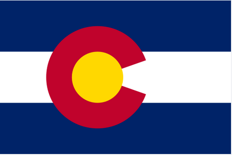
6. Colorado
It’s interesting how your quickly opinions can change on some of this subjective stuff. Although Colorado has an objectively nice flag, this morning it’s looking like a piece of sporting apparel and I’m now pondering if it belongs in the category of flags that need a minor tweak. Not going to do it; that way lies madness. Well, maybe in the comments if there’s interest.
This flag technically breaks two of NAVA’s five criteria, there are four colors and the large “C” is text. But this is another flag that Good Flag, Bad Flag uses to demonstrate that one can depart from their principles “with caution and purpose,” calling the “C” a “stunning graphic element.”
The Colorado National Monument
Each of the four colors carries symbolic meaning. The red, perhaps most significantly, represents the land. “Colorado,” the name of first the river and then the state literally means “colored red.” The gold evokes the abundant sunlight, the blue the sky, and the white, the snow-capped mountains.
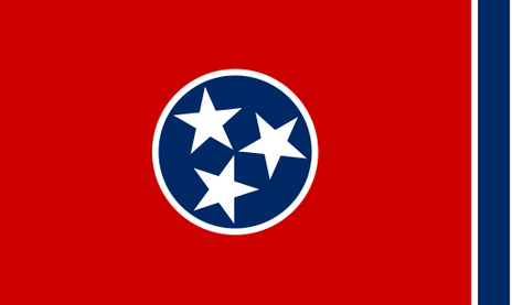
5. Tennessee
The “Tri-Star Flag” is a nice flag with some nice symbolism, but boy is that a lot of red! That’s not really to my taste. Still, the centerpiece makes a nice symbol that is used by businesses and sports teams. The three stars represent the three “Grand Divisions” of Tennessee defined in the state constitution, East Tennessee, Middle Tennessee, and West Tennessee. These divisions are “bound together in indissoluble unity” within the blue circle by the “unending white band.” The blue band is merely a design element to relieve, as LeRoy Reeves, the designer puts it, “the sameness of the crimson field and prevents the flag from showing too much crimson when hanging limp. The blue band is symbolically a bit of a missed opportunity. In its current location, it could represent the Blue Ridge Mountains on the eastern border of the state. On the left, it could symbolize the Mississippi River, the western border. Do both and the flag becomes a metaphorical map of Tennessee. The star placements are established by state law and are a bit fiddly; a commemorative stamp issued in 1976 showed the stamp upside down.
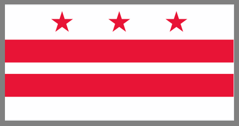
4. The District of Columbia
The nation’s capital was founded in 1791. It had to wait until 1938 before a flag was chosen, but at least it’s an objectively good flag. The design is striking and is based on the Washington family’s Coat of Arms so the symbolism more-or-less takes care of itself. The flag was designed by a three-member commission appointed by Congress and was initially a symbol of the District’s lack of representation. Ironically, Washingtonians have since embraced the flag. It appears on merchandise throughout the district and is used prominently by the DC Statehood Movement.
When a seal or a coat of arms is used in the design of a flag, the usual approach is to merely place the seal on a solid colored background as we see at left, and then perhaps add the name, a date of a motto to the flag. None of those are improvements. The DC flag is an object lesson in how to use a seal or a coat of arms as an inspiration for flag design. The trick, in this case, is to focus on one or two clear and distinctive design elements, rather than trying to include the entire coat of arms. Another excellent example can be found in this video.
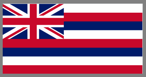
3. Hawaii
Having the British flag in the canton of one of the thirteen original colonies would be kind of obnoxious, but here makes for a beautiful and distinctive flag. Before the War of 1812, King Kamehameha I flew the Union Flag over his home. This flag had been a gift from Britain’s King George III. During the war, this was replaced by the American flag until some British officers objected. Kamehameha responded by commissioning a new flag that was a hybrid of the two. Britain is represented in the canton while the stripes and their colors symbolize the United States. The eight stripes each stand for one of Hawaii’s major islands, echoing the symbolism of the American flag. Hawaii’s flag is one of only two state flags to have been the flag of an independent country and it is the only flag to fly over a kingdom, a republic, an American territory, and a state.
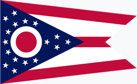
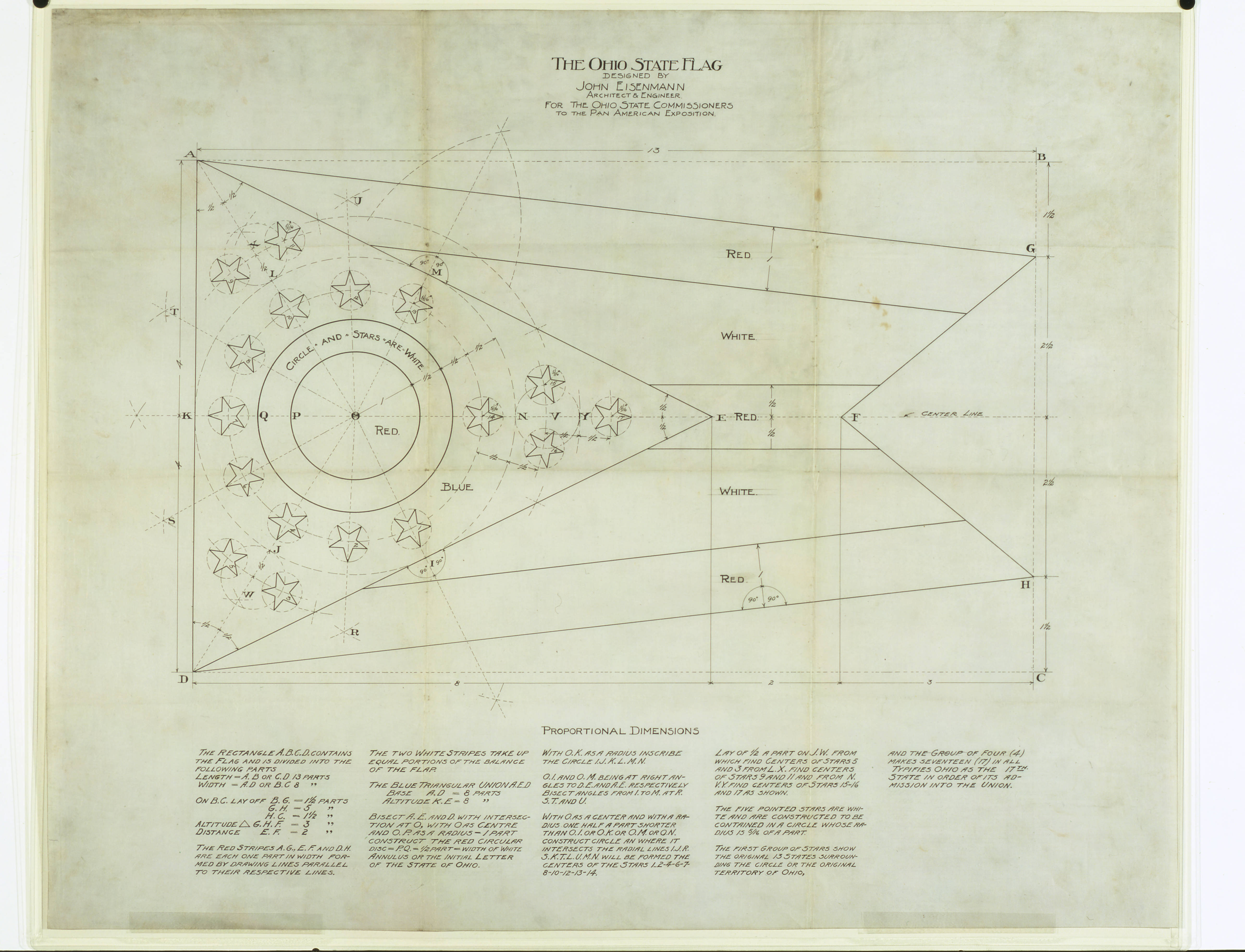
2. Ohio
NAVA’s fifth principle of flag design is to “Be original or be related.” Ohio’s flag is proof that the “or” is not exclusive. It’s certainly “related.” Of all the state flags, Ohio’s flag has the strongest resemblance to the Stars and Stripes. It is also original. It’s the only non-rectangular state flag and the blue triangle on the hoist as well as the white-and-red “O” are distinctive.
Virtually every element of the flag has meaning. The triangular swallowtail shape is thought to hearken back to flags carried by Ohio units in the Civil and Spanish American wars. The five stripes symbolize the roads and waterways of the state while the blue field stands for Ohio’s hills and valleys. The 13 stars encircling the “O” represent the thirteen original states while collectively the 17 stars evoke Ohio’s position as the 17th state to join the Union. The “O” doesn’t merely stand for the state’s name, it also suggests an eye and thus Ohio’s nickname as the “Buckeye State.”
It’s interesting that, although we now recognize Ohio’s is a well-designed flag, it wasn’t initially so well received. The “seal-on-a-bed-sheet” model was ubiquitous among state flags. It was seldom used and compared to the flags of Cuba and the Philippines. It was particularly disparaged for the red center of the O’s similarity to the Japanese flag’s sun.
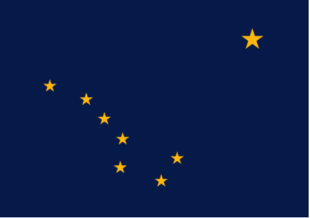
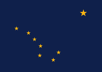
1. Alaska
Readers of this blog might recall that Alaska is my favorite state flag. It’s a simple, attractive flag. If you know anything about celestial navigation, at least some of the symbolism is easy to deduce. The location of the big dipper makes it clear that the larger star is the north star; symbolizing that Alaska is the northern-most state.
But there’s a lot more going on here, worthy of a post of its own. The flag was initially chosen as the territorial flag in 1927 after the Governor held a design contest open to school children in grades 7 through 12. The winner of the contest was 13-year-old Benny Benson, a native Alaskan. His entry was the unanimous choice of the panel of judges and was adopted unanimously by both houses of the territorial legislature. There’s synergy here; the blue represents not only the night sky but also the color of a forget-me-not which was later chosen as the state flower. Marie Drake, the assistant commissioner of education wrote a poem about Benson’s symbolism for an educational program about the flag. Elinor Dusenbury, a former Alaska resident, set the poem to music out of, as she put it, “pure unadulterated homesickness for Alaska!” The song was quite popular; it was chosen as the territorial song in 1955 and became the state song when Alaska became the 49th state. It is the only state song about a flag.
Benny Benson holding a homemade version of his flag
Eight stars of gold on a field of blue Alaska’s flag. May it mean to you The blue of the sea, the evening sky, The mountain lakes, and the flow’rs nearby; The gold of the early sourdough’s dreams, The precious gold of the hills and streams; The brilliant stars in the northern sky, The “Bear,” the “Dipper,” and, shining high, The great North Star with its steady light, O’er land and sea a beacon bright. Alaska’s flag to Alaskans dear, The simple flag of a last frontier.
Alaska’s Flag
Coming soon(?), the state flags that require minor alterations.
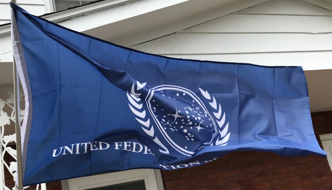
We’re flying a new flag this morning; specifically the flag of the United Federation of Planets. It flew for a day a few weeks ago, but it was wet and windy and the flag kept getting tangled around the pole so I decided to take it down for a bit.
In the meantime, we purchased a Valley Forge Tangle-Free Aluminum Pole (not pictured above) from the Horseheads Do It Center. It’s working beautifully so far. The flag is affixed directly to the pole through the grommets and the entire top section of the pole rotates freely. The weight of the flag itself keeps it from wrapping around the pole.
I like this flag, however, it puts me in mind of a lot of state flags, most of which are pretty dreadful. I, therefore, thought I’d look at it in terms of the North American Vexillological Association’s criteria for evaluating/creating flags.
NAVA’s five criteria for creating a good flag were first codified in 2001 when they conducted a survey to choose the best and worst flags on the continent. These are:
The design of the flag should be simple enough that a child could draw it from memory.
It should use clear and understandable symbolism.
The flag should use common colors; probably no more than four different ones.
Both text and seals should be avoided.
Finally, the flag should be unique as it represents a distinct entity. It can however, show similarities to other flags, to show connections.
A nice example of the last criterion is the similarities between the flags of Ohio and the United States. The flags are distinct but the common elements make it clear that the US and Ohio are closely related.
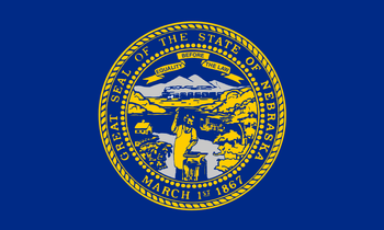
We could segue into a long discussion of state and province flags, but we’ll save that for another day. The existing state flag closest to the bottom of the NAVA survey was Nebraska.
The dubious distinction for last place was given to Georgia, but that flag was changed in 2003. Meanwhile, my favorite state flag has to be Alaska; simple and elegant with clear symbolism. It’s a classic.
The UFP flag fares pretty well according to the NAVA standards. The design is simple and clean. The colors, blue and white are classic and attractive. The weakest element of the flag is the text. Like the conventional wisdom assumes, it’s difficult to read as the flag waves in the wind, especially as the text is backward on one side of the flag. It’s also an odd choice; the Federation contained over 150 member worlds at one point, each of which probability had its own language. I think it remains an odd choice even though English had evolved into “Federation Standard.”
To think about the symbolism, it makes sense to look back to the obvious inspiration for the UFP flag, the Flag of the United Nations. The blue color was chosen in contrast to “red, the war color.” The world map represents all the people of the world. The map projection is surrounded by olive branches, a common metaphor for peace.
The similarities to the UFP flag are striking and the symbolism transfers in a straightforward manner. The branches are similar, though may not be of terrestrial origin. The galactic map with the density of the stars in an off-center diagonal line is evocative of a section of one of the spiral arms of the galaxy.
Earth and presumably most of the other member worlds of the Federation are located in the Orion Spur, a minor arm of the Milky Way, which exists between the Perseus and Sagittarius Arms of the galaxy. In-universe and otherwise, the similarities between the UFP flag and the UN flag make sense since one organization is clearly an inspiration for the other. If the UN still existed in the 23rd Century, the two flags might be too similar to be flown together, but I suspect the UN flag has been supplanted by a “United Earth” flag.
One place where the symbolism of the UFP flag seems lacking is that there are three stars in the galactic map that are stylized as four-pointed stars rather than circles. These stand out and in a standard flag, these might represent the founding worlds of the Federation. Unfortunately, there are four; Earth, Vulcan, Andor, and Tellar Prime. This is not surprising. The UFP flag was designed long before the founding worlds were codified in “These are the Voyages…” the series finale of Star Trek: Enterprise. I might be inclined to add a fourth four-pointed star.