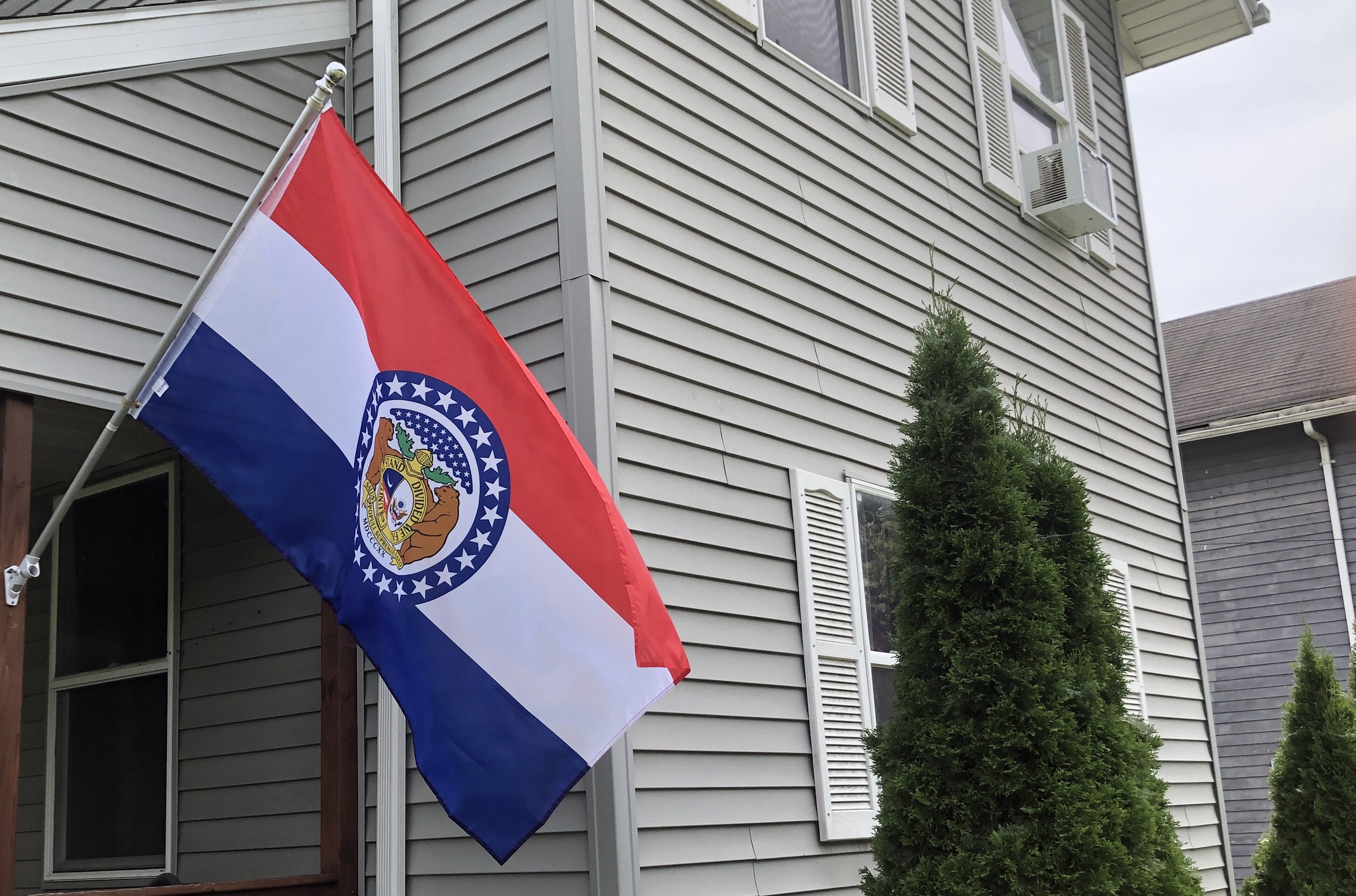
Happy (belated now) Flag Day 2022! We’re flying the Missouri state flag for the occasion.
Columns. They seem like a good idea at the time, but then things get busy and you start to feel self-consciously like Doctor Who (the program). It’s been altogether too long since your last episode and you’re hoping that people are going to lose interest. But you have a season of Sherlock to do, or whatever it is that Chris Chibnall did in between seasons. You get the idea.
Without further ado, here’s our latest installment on State Flags. If you recall our first installment, we’re dividing the US state flags into four categories
- Flags that need no changes
- Flags that only need very slight changes
- Flags that have well-established and aesthetic alternatives and
- Flags that require significant changes.
We’ve run through the top category in our first two installments but today we’re jumping ahead to category four because we’re flying the Missouri flag as we did for the Bicentennial of Missouri becoming a state last August when I started this post.
You might recall that Missouri was admitted to the union as part of the Compromise of 1820. It was a very similar situation to today. Today a potential state can’t become a state, even if it makes perfect sense for it to be one because it’s likely to elect Senators and Representatives from the wrong party. It was the same deal in 1819 except we cared about whether a state would support slavery or not. The Compromise of 1820 allowed Missouri and Maine to enter the union together one as a free state, the other as a slave state.
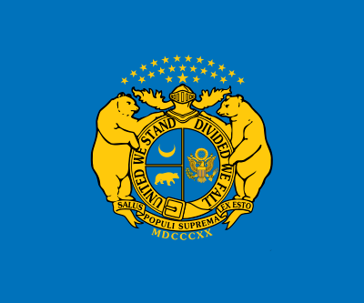
It took nearly a century for Missouri to adopt a state flag although there were many unofficial flags flown by Missouri regiments fighting on both sides of the Civil War. These included flags with the state’s Great Seal in gold on a blue background, which is a quintessential seal on a bedsheet. The confederate version of this flag has the cloud of stars reduced to just a single star to symbolize Missouri as an independent state.
The creation of the official state flag started in 1908 when the Daughters of the American Revolution in Cape Girardeau noticed the need for a state flag. They set up a committee and appointed Marie Elizabeth Oliver its chair. Oliver researched state flags extensively, especially the methods for their design and adoption. She came up with her own design starting with the state coat of arms with the cloud of stars recycled as a blue circle with white stars surrounding the rest of the design. This was then superimposed on a red, white, and blue horizontal tri-color. This design was proposed to the state legislature in 1909 and 1911 before finally being adopted in 1913.

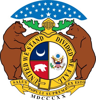
The Flag inherits a lot of symbolism from the Great Seal. The cloud of stars signifies that Missouri was the twenty-fourth state to join the union while two bears on either side of the central shield represent courage and strength. The belt buckle is an interesting element; it’s part of the circle that proclaims “United We Stand Divided We Fall.” That a belt with that motto could be unbuckled seems like a bit of a mixed message. One source I consulted suggests that the buckle combined with the helmet stand for the idea that Missouri is a strong state that must be free to solve its own problems while another explicitly ties the buckle to the possibility of secession. The crescent moon holds out hope for the future.
The additional elements of the flag enhanced the symbolism. As quoted by US Flag Supply:
“…The Oliver flag embraced national pride and at the same time expressed characteristics of Missouri and Missourians. The three large stripes were symbolic of the people of the state was the blue stripe represented vigilance, permanency and justice, the red represented valor, and the white stripe symbolized purity. The Missouri coat-of-arms appeared in the center of the flag, signifying both Missouri’s independence as a state, and its place as a part of the whole United States. Having the coat-of-arms in the center of the national colors represents Missouri, as she had the geographical center of the nation. By mingling the state coat-of-arms with the national colors of red, white and blue, the flag signified the harmony existing between the two. Twenty-four stars surrounded the coat-of-arms, representative of Missouri’s position as the 24th state admitted to the Union.”
Using the tricolored background makes Missouri’s flag more attractive than the typical state flag that just utilizes a seal on a solid background. Still, it’s far from ideal. The seal with its small sections and text is too detailed to be discernible from any distance.

In considering a redesign of the flag, it makes sense to maintain the best elements of the flag while using them in a simplified design and incorporating some more modern symbols. I started with the wavy blue and white lines from the flag of St. Louis to represent the Missouri and Mississippi rivers. The arch, as it does for St. Louis, can represent Missouri’s importance in the exploration and settlement of the American West. As I was writing this I encountered a claim that not only is St. Louis the westernmost eastern city in the US, Kansas City is the easternmost western city in the nation. The colors, the bear, and the crescent can maintain their original meanings.
Full disclosure here: I’ve seen similar proposed flags, lots of which predate this one, on the Facebook group U.S. State Flags – Current, Historical, and Proposed. That group is worth checking out if you’re interested in state flags and/or flag design.

My wife, Joanne was born and raised in Missouri and her favorite element of the state flag is the bears, particularly the two larger ones. Here’s an earlier attempt including one. Unfortunately, I don’t have the skill that I would need to have the bear hug the arch like it does the disk. As an interesting side note, the bears on the Missouri flag are described as Grizzlies even though the only species of bear that is native to Missouri is the American Black Bear. The use of Grizzlies may have been inspired by encounters that Missourians Hugh Glass and Jed Smith had with the creatures. Those harrowing stories can be found here.
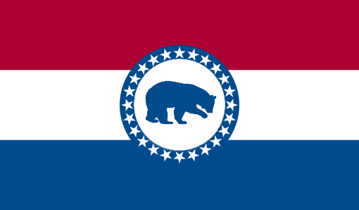
Finally, you might think that a less radical redesign is in order, in which case I would suggest something like this, cleaning up the design by replacing the seal with a single element contained within it. Again I’m sure that there are many proposals similar to this one and I’ve seen one with a fleur de lis. There are many potential options for that central element. I’m deferring to the Missouri native in the family; we’re going with the bear.
References:
- Missouri Compromise, Accessed 14 June 2022
- Flag of Missouri, Accessed 14 June 2022
- Missouri’s Flag History, Accessed 15 June 2022
- The History of Missouri’s Flag, Accessed 15 June 2022
- Great Seal of Missouri, Accessed 15 June 2022
- THE MISSOURI STATE GUARD AND OTHER “SECESSION FLAGS” IN MISSOURI, 1861, Accessed 16 June 2022
Image Credits:
- Featured Image and Proposed Flags: (c) 2022, ComicsTheUniverseAndEverything.net
- Other images from Wikimedia commons

