
Happy Earth Day!

I started this morning revisiting Carl Sagan’s “Pale Blue Dot” video. If you’re not familiar, it was inspired by a photo of the Earth taken by the Voyager 1 Space Probe from beyond the orbit of Neptune.
From the vantage point of a probe leaving our solar system, the Earth is tiny. And yet, Earth is the sole abode of life. Every creature we’ve ever encountered is here. All of Humankind’s history, all its accomplishments, challenges, and catastrophes happened here on this minuscule dot in a universe that, for us at least, is functionally infinite. As the world becomes more and more acrimonious we should embrace Sagan’s message of perspective and in this inconceivably vast and indifferent universe, respond with kindness.
This morning I also watched a bit of Apple TV+’s For All Mankind which has as a major theme terrestrial politics carried, alongside humans, beyond the atmosphere.
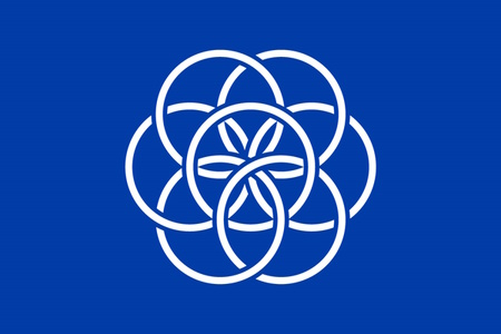
This year we’re flying the proposed International Flag of Planet Earth (IFOPF) that was created by Oskar Pernefeldt in 2015. To judge by the pictures included on the IFOPF website, it was inspired by the same thing as James W. Cadel’s Flag of the Earth, a desire to create a symbol for all of us on this planet and to leave nationalism behind as we venture into the larger universe.
The IFOPE is a lovely flag that checks almost all of the North American Vexillological Association’s criteria for evaluating/creating flags.
NAVA’s five criteria for creating a good flag are:

- The design of the flag should be simple enough that a child could draw it from memory.
- It should use clear and understandable symbolism.
- The flag should use common colors; probably no more than four different ones.
- Both text and seals should be avoided.
- Finally, the flag should be unique as it represents a distinct entity. It can, however, show similarities to other flags, to show connections.
Let’s take them each in order except for item #2.
Criteria #1 Simplicity:
Broadly speaking the IFOPE clears this easily, the design is merely interlocking circles on a blue background. It’s easy to remember and it’s easy to imagine a child drawing this with a white crayon on a piece of blue construction paper. It wouldn’t, however, be a simple matter to replicate the way that the circles overlap. More on that in a bit.

Criteria #3 Use only a few, common colors:
Again. an easy yes. There are only blue and white, a natural and popular pairing. The rich shade of dark blue, chosen to contrast nicely both with the blackness of space and the white of a spacesuit, looks great! Although now I’m noticing that the flag I purchased might not have quite the right shade of blue. Damnit.
Criteria #4 Avoiding Text and Seals:
Nothing needs to be said here.
Criteria #5 Uniqueness and connections.
There are a lot of blue and white flags and some of them have circles. None of those look enough like the IFOPE to create confusion, that’s pretty good. It gets a bit better. The design is distinctive enough and large enough that the flag remains identifiable even while at rest.
As far as connectedness is concerned the IFOPE is reminiscent of the flag of the United Nations. It begs the question, why not choose the same shade of blue? Other than that it works perfectly, with one representing our planet and the other all the nations on the planet, united in the name of peace. This fits in well with Pernefeldt’s vision. On the flag’s website, we read. “This flag will not save the planet, but it inspires those who will.” High marks for criteria five.

So, what about Criteria #2, symbolism?
I want to give this flag high marks here as well because the core symbolism is great. We can see the blue background as a representation of the universe. Pernefeldt likens the collection of circles to a flower. The flower, Pernefeldt tells us, represents life on Earth while the arrangement of the circles represents “how we’re all connected.” That’s pretty great. I might be inclined to broaden the flower into a symbol of the entire Earth so we can really lean into the ambiguity of his statement about connectivity. People are connected, countries are connected, and industries are connected. Life is connected to the air, to the land, to the water, and to the Earth itself. All of these influence and are affected by the rest.
But the blue background is also taken to symbolize the water while inside the inner circle, you can see a second flower which represents the beauty of life on Earth. I think there might be more that I’ve lost track of. It’s a bit much. The visual design, clean and simple, has an admirable restraint that the symbolism seems to lack.
I also keep thinking about the curious asymmetry of the “flower.” The connectedness metaphor would work best if every circle is clearly interlocked with every other. That is clearly not the case. It’s not even immediately clear to me that the circles form a single chain so that thay are all least linked together. That isn’t essential, but to know it would underline the central metaphor and eventually, I’m going to have to check.

But the last bit is the clincher; there’s nothing about the IFOPE that calls to us and proclaims that it is a symbol of the planet Earth. It’s a lovely flag but we only know it’s a flag for the planet Earth because we’re told that it’s a flag for planet Earth. Sure, maybe that’s the case with most flags, but occasionally a flag will show you something about its subject. The flags of Cyprus and Kosovo show the outline of their countries, the North Star on the flag of Alaska highlights the fact that it is the northernmost US State and the St. Louis flag depicts a confluence of rivers. The southern cross tells us a country is in the Southern Hemisphere. Certain color choices indicate that a flag represents a country that is probably in Africa or the Middle East. Other flags have taken centuries to build up that kind of identification.
Eventually, the flower in the center of the IFOPE may come to symbolize Earth in the public consciousness, but for now, it’s a nice flag that could represent thousands of different things. Cadel’s “Flag of the Earth” on the other hand is distinctly a flag for planet Earth and for me, that makes it the clear favorite.
Or maybe we can go back to Carl Sagan’s Pale Blue Dot. How’s this for a flag?
References:
- The International Flag of Planet Earth accessed 21 April 2023

