One Giant Leap for Mankind

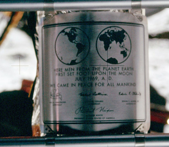
Today is 20 July 2019; fifty years to the day that humans first set foot on another celestial body marking the culmination of the Space Race and one of humanity’s greatest technological achievements.

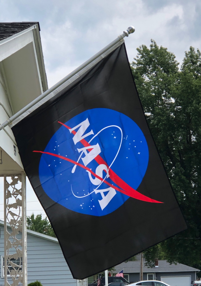
To commemorate the occasion, we’re flying a flag featuring the NASA Insignia, a streamlined version of the NASA seal. Other than the the fact that it contains text, the insignia is a perfect centerpiece for a flag. It’s striking without being too busy and it’s easy to sketch. It also has nice, clear symbolism.

From the NASA website:

The round red, white and blue insignia, nicknamed the “meatball,” was designed by employee James Modarelli in 1959, NASA’s second year. The design incorporates references to different aspects of the mission of the National Aeronautics and Space Administration. The round shape of the insignia represents a planet. The stars represent space. The red v-shaped vector represents aeronautics. The circular orbit around the agency’s name represents space travel.

The Symbols of NASA
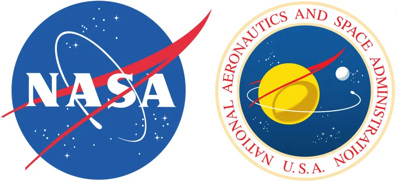
The NASA insignia and the more formal seal

We spent a decent amount of time deciding which flag to fly for the occasion. Our first thought was the Earth Day flag, and then an Earth Day flag with a stylized crescent moon and the southern cross, but neither of those seemed to feature the Moon clearly enough. There were other options, but the NASA flag seemed most appropriate.

The first two options above could be deemed “photograph flags” and, for my purposes, flying a flag based on a photograph seems fine. If any of the images below were available in flag form, we might have chosen it. Perhaps I’ll order one of these custom made for the 51st anniversary.

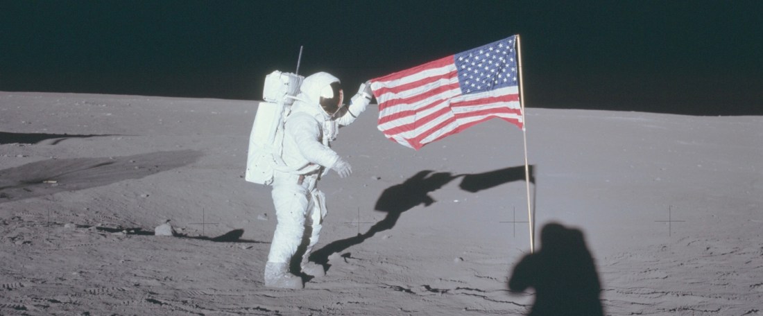
The flag played a prominent role in the Lunar Landing. One of the more dramatic moments was the raising of the flag, which I can clearly remember seeing on the teevee. I explicitly recall being puzzled about the flag’s behavior. It seemed to snap out with the top sticking straight out from the pole. I was only five, but this seemed strange. I’d seen flags before and they certainly didn’t do this. It must be something strange about space, I thought. Or the Moon. Or something else. Here’s the news footage.

Astronauts Plant the American Flag on the Moon.

Turns out the flag had its own “frame.” Five year old me missed that. If you have any doubts about the significance of the flag in this event, let’s turn to Arthur C. Clarke’s July 20, 2019: Life in the 21st Century. Published in 1986, this book is a collection of Clarke’s speculations about the state of life and technology on this very day. The first chapter is a fictional letter, written by Clarke himself, from his home in Clavius City, Luna on the book’s titular date. It begins thusly.

It doesn’t seem like fifty years – but I cannot be sure which memories are false and which are real. Present and past are inextricably entangled. The monitor screen has just shown the ceremony at Tranquility Base, culminating with the third hoisting of the American flag. It was blown down, of course, by the blast of the Eagle’s ascent stage, and lay there on the trampled Moon soil for thirty-six years until the Apollo Historical Committee reerected it. Then the big quake of 2009 knocked it down again; this time, we’re assured, it would take a direct hit by a fair-sized meteor to lower it…

Arthur C. Clarke’s July 20, 2019: Life in the 21st Century

It’s a romantic image; historical societies reerecting and preserving the flag for future generations to see and enjoy, but sadly, that may never come to pass. The condition of the flags on the moon is a subject of speculation. The conditions are harsh. The surface is bombarded with UV radiation without the protection we receive from Earth’s atmosphere and the temperature ranges from -280 to +240 degrees Fahrenheit. Some of the flags could have disintegrated entirely. At a minimum, the flags must be so sun bleached that they are now completely white. At least as recently as 2012, however, there was evidence that the flags of Apollo 12, 16 and 17 were still standing. You can read about the condition of the flags in the links below.
References:

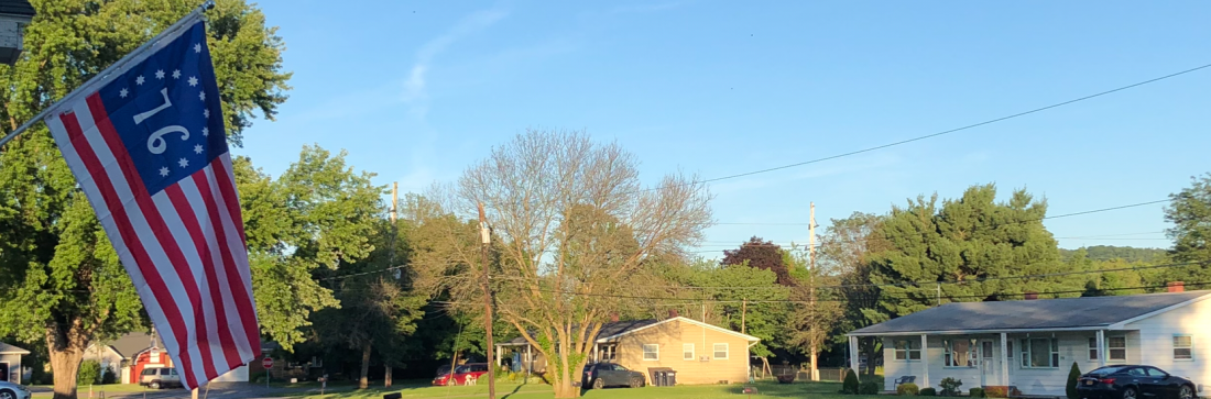
Happy 4th of July! Bennington Flag

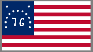
A picture of the Bennington Flag.

Happy Independence Day everyone! Last year to celebrate, we flew the Betsy Ross flag. This year we’re flying what is, at least according to legend, another Revolutionary War flag, the Bennington Flag. Legend has it that this flag was flown by General John Stark and his men at the Battle of Bennington, which happened in Walloomsac, New York on 16 August 1777. General Stark’s forces, including troops from the Republic of Vermont, defeated the British forces under the command of Lt. Colonel Friedrich Balm. This was a turning point in the war, leading to the defeat of the British at the Battles of Saratoga.

So, the Bennington Flag is purportedly an “early US” flag that stands beside many others. The “Betsy Ross” flag is probably the most recognizable but others include the Cowpens Flag (below, right) and the flag designed by Francis Hopkins for the US Navy which used 6-pointed stars and arranged the stars in rows with a 3-2-3-2-3 pattern.

Two Early US Flags

Why so many? Well, on 14 June the Second Continental Congress passed the Flag Resolution of 1777.

Resolved: That the flag of the United States be thirteen stripes, alternate red and white; that the union be thirteen stars, white in a blue field, representing a new constellation.

This leaves a lot unspecified, namely the arrangement and orientation of the stars, the kind of star, the size of the union (or “canton”), and whether there are 7 red stripes or 7 white stripes. Individual flag makers made their own decisions on these points. That led to a plethora of variants. The Bennington Flag mostly adheres to the Flag Resolution with some distinctive variations, including the arrangement of the stars inside a canton that is taller than it is wide. The choices to make the outer stripes white and to use 7-pointed stars are also uncommon. The one departure is the addition of the large “76” in the canton to reference the passage of the Declaration of Independence.

The legend claims that the original Bennington Flag was flown at its namesake battle and was carried off the battlefield by Nathanial Fillmore He passed the flag onto his nephew, Septa Fillmore who carried it in the Battle of Plattsburg, the turning point in the War of 1812. Subsequently, the flag was passed down to other relatives including President Millard Fillmore and Philetus Fillmore who flew the flag during the centennial celebrations for American Independence and the Battle of Bennington. Because of its close affiliation with the family, this flag is also called “the Fillmore Flag.” If I were determining the nomenclature, I’d probably keep the term “Fillmore Flag” for the original flag that now resides in the Bennington Museum.

The Green Mountain Boys Flag

That Fillmore Flag was examined by Grace Rogers Cooper, Curator of Textiles at the Smithsonian Institution. She determined it to be of 19th-century origin and dated it to around 1820. The flag itself is made of cotton and sewn with cotton thread neither of which would have been readily available in 1777. Various theories exist as to its possible origin; it may have been made during the War of 1812 to evoke the spirit of the Revolution or it may have been made to celebrate the visit of Lafayette to the US in 1824 or the semicentennial of the signing of the Declaration of Independence. One thing that’s generally agreed upon is that that particular flag could not have been at the Battle of Bennington. What was flown at the battle? The “Green Mountain Boys Flag” shown above, is a regimental standard known to have been flown by General Stark and his men. The Green Mountain Boys Flag is currently the flag of the Vermont National Guard.

References:

Picture Credits:

The UFP Flag and Beginning Vexillology

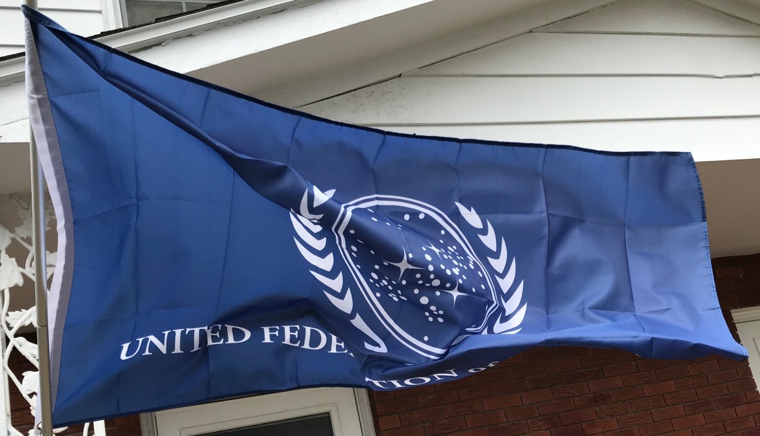
We’re flying a new flag this morning; specifically the flag of the United Federation of Planets. It flew for a day a few weeks ago, but it was wet and windy and the flag kept getting tangled around the pole so I decided to take it down for a bit.

In the meantime, we purchased a Valley Forge Tangle-Free Aluminum Pole (not pictured above) from the Horseheads Do It Center. It’s working beautifully so far. The flag is affixed directly to the pole through the grommets and the entire top section of the pole rotates freely. The weight of the flag itself keeps it from wrapping around the pole.

I like this flag, however, it puts me in mind of a lot of state flags, most of which are pretty dreadful. I, therefore, thought I’d look at it in terms of the North American Vexillological Association’s criteria for evaluating/creating flags.

NAVA’s five criteria for creating a good flag were first codified in 2001 when they conducted a survey to choose the best and worst flags on the continent. These are:

  1. The design of the flag should be simple enough that a child could draw it from memory.
  2. It should use clear and understandable symbolism.
  3. The flag should use common colors; probably no more than four different ones.
  4. Both text and seals should be avoided.
  5. Finally, the flag should be unique as it represents a distinct entity. It can however, show similarities to other flags, to show connections.

A nice example of the last criterion is the similarities between the flags of Ohio and the United States. The flags are distinct but the common elements make it clear that the US and Ohio are closely related.

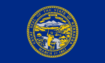
Flag of  Nebraska

We could segue into a long discussion of state and province flags, but we’ll save that for another day. The existing state flag closest to the bottom of the NAVA survey was Nebraska.

Flag of  Alaska

The dubious distinction for last place was given to Georgia, but that flag was changed in 2003. Meanwhile, my favorite state flag has to be Alaska; simple and elegant with clear symbolism. It’s a classic.

The UFP flag fares pretty well according to the NAVA standards. The design is simple and clean. The colors, blue and white are classic and attractive. The weakest element of the flag is the text. Like the conventional wisdom assumes, it’s difficult to read as the flag waves in the wind, especially as the text is backward on one side of the flag. It’s also an odd choice; the Federation contained over 150 member worlds at one point, each of which probability had its own language. I think it remains an odd choice even though English had evolved into “Federation Standard.”

Flag of the United Nations.svg

To think about the symbolism, it makes sense to look back to the obvious inspiration for the UFP flag, the Flag of the United Nations. The blue color was chosen in contrast to “red, the war color.” The world map represents all the people of the world. The map projection is surrounded by olive branches, a common metaphor for peace.

The similarities to the UFP flag are striking and the symbolism transfers in a straightforward manner. The branches are similar, though may not be of terrestrial origin. The galactic map with the density of the stars in an off-center diagonal line is evocative of a section of one of the spiral arms of the galaxy.

Here's what the Milky Way may look like from deep space ...

Earth and presumably most of the other member worlds of the Federation are located in the Orion Spur, a minor arm of the Milky Way, which exists between the Perseus and Sagittarius Arms of the galaxy. In-universe and otherwise, the similarities between the UFP flag and the UN flag make sense since one organization is clearly an inspiration for the other. If the UN still existed in the 23rd Century, the two flags might be too similar to be flown together, but I suspect the UN flag has been supplanted by a “United Earth” flag.

One place where the symbolism of the UFP flag seems lacking is that there are three stars in the galactic map that are stylized as four-pointed stars rather than circles. These stand out and in a standard flag, these might represent the founding worlds of the Federation. Unfortunately, there are four; Earth, Vulcan, Andor, and Tellar Prime. This is not surprising. The UFP flag was designed long before the founding worlds were codified in “These are the Voyages…” the series finale of Star Trek: Enterprise. I might be inclined to add a fourth four-pointed star.

References: