Happy Flag Day 2024!

It’s hard to believe it’s been a year since my last vexillological post, so much for picking up the pace. Still, Flag Day calls for a special effort!
Mostly this year, we’ve been flying flags I’ve already written about. There was the Maine 1901 flag over the holidays, and then the Flag of the Earth for Earth Day. Until yesterday we were flying the Ally flag for Pride Month. That one didn’t get to fly for long; June is a busy month for flag-related events. Juneteenth is right around the corner.
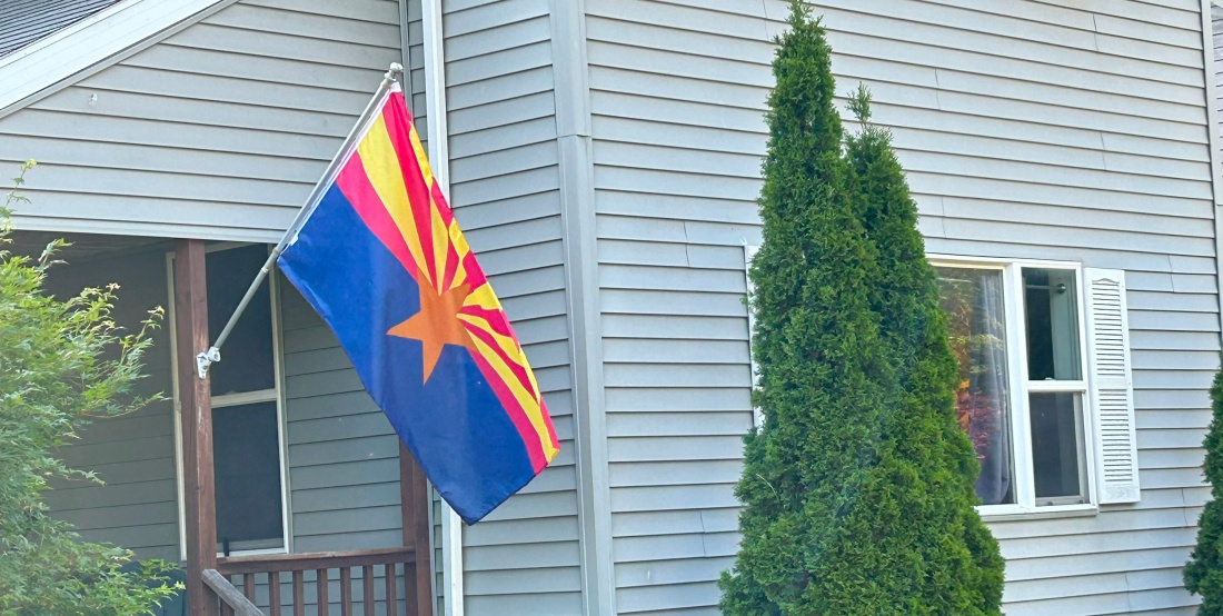
So, today, for Flag Day, we’re flying the Arizona State Flag for the first time. That gives us an opportunity for another installment of our series on State Flags.

Arizona was one of the first flags I intended to write about in this series. I was reminded of this recently when the Facebook group U.S. State Flags – Current, Historical, and Proposed had an extensive conversation about the Arizona flag’s design.
The Arizona flag depicts a copper-colored star representing a setting sun and, by extension, Arizona’s status as a western state within the US. The upper half of the flag shows thirteen rays, alternating red and weld-yellow honoring the original thirteen states of the US. The lower half of the flag is Liberty Blue. The red and blue colors on the flag match those on the US flag. The copper of the star honors Arizona’s position as the largest producer of copper in the United States.
You might notice that this is a lovely flag. It embodies all 5 of the North American Vexillological Association’s five principles of good flag design. In fact, NAVA chose it as the sixth-best flag from the continent in a 2001 poll. So why wasn’t it included in our first entry which encompasses the nine best state flags?
Recall, In our first installment, we decided to divide the US state flags into four categories:
- Flags that need no changes,
- Flags that only need very slight changes,
- Flags that have well-established, aesthetic alternatives, and
- Flags that require significant changes.
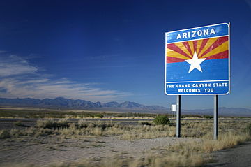
Arizona is our first flag in category two, it’s nearly perfect, but there’s one thing to fix. The flag needs more contrast and, as evidenced by this road sign I suspect that someone in the Arizona Department of Transportation thinks so too.
So, here’s my tweak and I make no claims of originality; it’s a straightforward adaptation and many others have hit on the same or similar ideas. For all I can remember, that road sign might have been my inspiration.
To get the needed contrast, we take a different color from the Stars and Stripes and make the star white. That though, takes away the most Arizona-specific color from the flag and thus we change the red stripes to copper. That’s it. We get a flag that’s a near equivalent to the current version with two colors and a five-pointed star from the national flag, thirteen rays to represent the thirteen original colonies and the color copper to symbolise, well, copper. All the symbolism remains intact.


My first version is on the left, above. That’s a nice flag and there is plenty of contrast; the weld-yellow is rich enough that the white star doesn’t fade into the background. The copper and gold rays feel more evocative of sunlight to me. Alan Hardy of the State Flags Facebook group suggested swapping the red and yellow rays so I tried this with that design as well, on the right. That’s nice too; I’m not sure which I like better.

Also, if you’re wondering, this was the winner of the Redesign Study on Facebook. That was an interesting flag study to follow. Usually studies work on terrible, awful, no good, very bad flags and the suggestions are all over the place. This one though started with a near perfect flag. The proposals showed that as most, like mine were minor variations on an excellent theme.
References:
- Flag of Arizona Accessed 09 June 2024
- Facebook Group: U.S. State Flags – Current, Historical, and Proposed, Accessed 14 June 2024
- State Flags: The Good, Comics, The Universe and Everything, Accessed 14 June 2024
- State Flags: The Good, Continued, Accessed 14 June 2024
Image Credits:
- Featured And Second Images and proposed flags: (c) 2024, ComicsTheUniverseAndEverything.
- The Arizona Flag and The Roadsign are from Wikipedia.
- The winning flag image from above is from U.S. State Flags – Current, Historical, and Proposed

